-
Facilities & Operations Performance Management
In 2008, American University in Cairo (AUC) moved its main operations from downtown to New Cairo. With a beautiful campus designed to accommodate 5,500 full-time students and 1,500 faculty and staff, AUC’s $400 mil...Read Moreabout: Facilities & Operations Performance Management -
Infographics as an Alternative
While the office routinely uses Tableau dashboards to share data with the campus community, there are also projects where an infographic may be a more visually compelling alternative. The office has invested in two tools...Read Moreabout: Infographics as an Alternative -
The Story Behind the Stony Brook University COVID-19 Dashboard
In summer 2020, Stony Brook University’s Senior Executive team requested the development and launch of a public-facing dashboard to display information about COVID-19 on the campus. The Office of Institutional Rese...Read Moreabout: The Story Behind the Stony Brook University COVID-19 Dashboard -
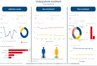
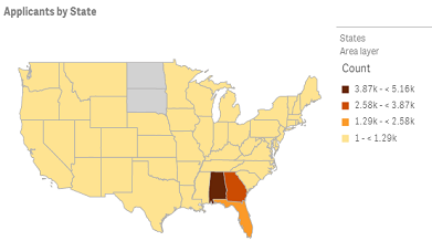
Improving Transparency With Applicant Public Access Portals
The Chilean Ministry of Education, through the Sub-secretariat for Higher Education, has instructed the universities to set up public access portals for applicants as a way to improve transparency in information and the ...Read Moreabout: Improving Transparency With Applicant Public Access Portals -
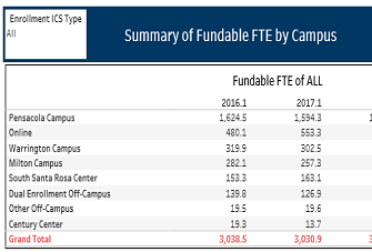
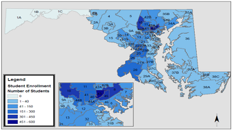
Visualizing Fundable FTE by Location
Pensacola State College is comprised of multiple campuses and centers that serve students in Northwest Florida. To visualize the total Full-Time Equivalent (FTE) of each campus and center, the Office of Institutional Res...Read Moreabout: Visualizing Fundable FTE by Location -
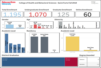
Facts at a Glance Dashboard
Each year, our Institutional Effectiveness (IE) office publishes an annual report for our Academic Affairs unit, which is one of five administrative divisions at Delaware State University. The Office of the Provost and E...Read Moreabout: Facts at a Glance Dashboard -
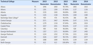
Technical Colleges and Perkins Data
A huge topic for our technical colleges has been the re-authorization of the Perkins law. This law brought substantial changes to procedures for requesting funds. One of the most significant changes was the implementatio...Read Moreabout: Technical Colleges and Perkins Data -
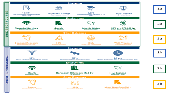
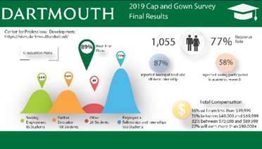
Student Outcomes: Kicking it up a Notch with Tableau
In preparation for reaccreditation, Dartmouth’s Office of Institutional Research decided to transform student outcomes data from multiple sources and formats into compelling visualizations. The publicly-available v...Read Moreabout: Student Outcomes: Kicking it up a Notch with Tableau -
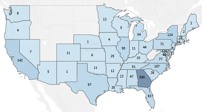
Mapping Economic Impact
Morgan State University commissioned an economic impact study in 2018. The publication of this study and the desire of the Office of Institutional Research to contribute data points to demonstrate the impact of our stake...Read Moreabout: Mapping Economic Impact -
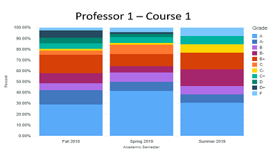
Grades Analysis Dashboard: Grades Inflation - Hype or Reality?
Founded in 1919, AUC is a leading English-language, American-accredited institution of higher education and center of intellectual, social, and cultural life of the Arab world. Its community of students, parents, faculty...Read Moreabout: Grades Analysis Dashboard: Grades Inflation - Hype or Reality? -
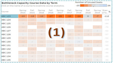
Bottleneck Capacity Courses Dashboard
Humboldt State University (HSU) is one of 23 campuses in the nation’s largest four-year university system, the California State University (CSU) system. The CSU Chancellor’s Office has broadly described a bot...Read Moreabout: Bottleneck Capacity Courses Dashboard -
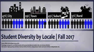
Pepperdine OIE IR Report: Student Diversity by Locale
See full report (PDF) Introduction Pepperdine is committed to the highest standards of academic excellence and Christian values, where students are strengthened for lives of purpose, service, and leadership. P...Read Moreabout: Pepperdine OIE IR Report: Student Diversity by Locale -
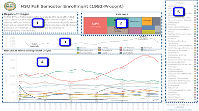
Long-term Enrollment Trends
Humboldt State University is one of 23 campuses in the nation’s largest four-year university system, the California State University system. While a formal office of Institutional Research was only founded in 2009,...Read Moreabout: Long-term Enrollment Trends -
Qlik Sense: Visualizing Future Enrollment/Tuition Revenue
This visual display focuses on predicting enrollment of admitted applicants depending on the amount of a scholarship offer. Predictions are visualized using the dashboard with a possibility to explore "what if" scenarios...Read Moreabout: Qlik Sense: Visualizing Future Enrollment/Tuition Revenue -
Digital Fact Book: From Data to Storytelling
Each year, most Institutional Research (IR) offices publish a Fact Book containing all the facts and figures pertaining to their institutions for distribution to board members, the leadership team, faculty, staff, and st...Read Moreabout: Digital Fact Book: From Data to Storytelling -
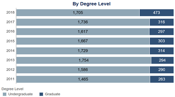
Degrees Awarded Dashboard: University of Southern Indiana
The Degrees Awarded dashboard is a section in our University Fact Book, which is powered by Tableau. The dashboard represents the number of degrees awarded each academic year and can be filtered by college, department, a...Read Moreabout: Degrees Awarded Dashboard: University of Southern Indiana -
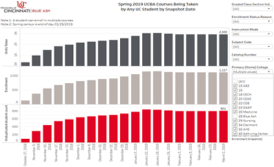
Course Enrollment Trends Dashboard
University of Cincinnati students often take classes offered at other UC campuses and vice versa. UC Blue Ash regional campus administrators and academic chairs wanted to better understand how many UCBA students we...Read Moreabout: Course Enrollment Trends Dashboard -
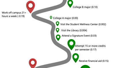
Visualizing Regression Results for Non-Statistics Audiences
The Office of Assessment at the University of North Florida (UNF) uses infographics to succinctly visualize student engagement and success data. We’ve found them to be a useful platform to share focused messages wi...Read Moreabout: Visualizing Regression Results for Non-Statistics Audiences -
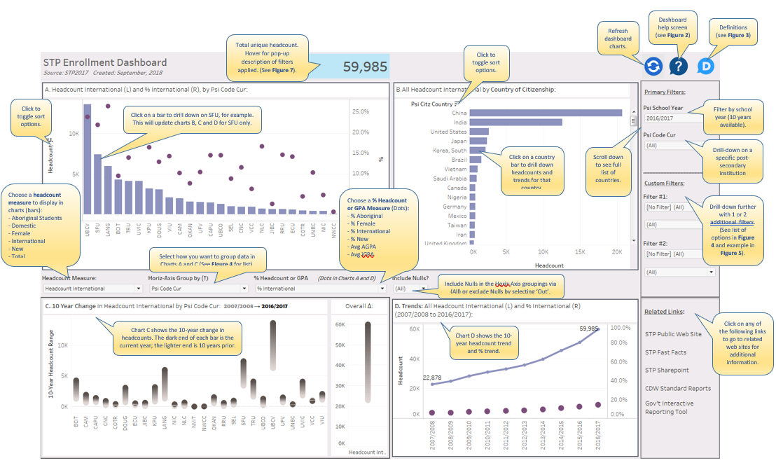
Visual Guide to STP Enrollment Dashboard in Tableau
Figure 1: STP Enrollment Dashboard Introduction Tim Miller, a blogger for DataViz at Data Science Central, recently offered suggestions for Creating a Great Information Dashboard. He nicely summarized some of the...Read Moreabout: Visual Guide to STP Enrollment Dashboard in Tableau -
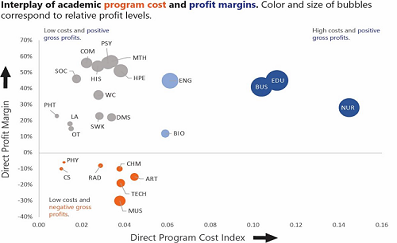
Analyzing Academic Program Fiscal Performance
Understanding the financial viability of academic programs is increasingly at the forefront of discussions at small colleges and universities. However, a simple analysis of direct gross profits can be misleading if not p...Read Moreabout: Analyzing Academic Program Fiscal Performance