Tip for Tableau Users
Analysts use visualizations to deliver complicated information in an easy to understand way. Dual axis function in Tableau helps users to be efficient with a message of visualization. Another name for a chart with a dual axis is a combination chart. Dual axis function can be used in a number of ways. For example, a combination chart can combine a line and a bar graph, two bar graphs, or a map and a pie chart. You may ask why would I do that? Well, that is a great question. Dual axis can help us to display survey responses in a form of little pie charts on the map that will tell us how many students from that area responded ‘yes’ or ‘no.’ Using a dual axis option, a bar graph of current student enrollment can be displayed with a line chart showing a trend of student enrolment from the last year, etc. Depending on the goal of your visualization, a dual axis function can help you be concise and creative. The instructions for a dual axis bar chart in Tableau are below.
What is the end goal for visualizations with dual axis?
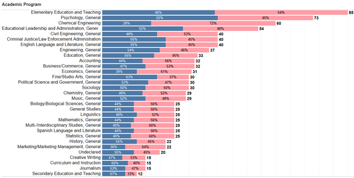
The end goal for this graph is to display gender percentages within different programs along with the program headcount. The final version of the chart is demonstrated below.
1. Select a dimension in rows. In this case, the dimension is ‘Academic Program.’

2. Select a measure in columns. The end goal is to display headcount; therefore, we select Student ID and choose distinct count measure.

3. Select a dimension and drag it onto color. Change the graph type to a bar graph. In this graph we would like to see gender ratios. Dimension ‘Gender’ is selected. You can edit and assign colors of the graph in the ‘Color’ menu.
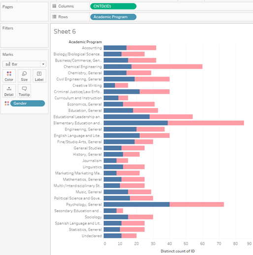
4. Select a second measure and put it in the columns. Since we need to display a headcount, we select ‘Student ID’ again. On the right-hand side, in the ‘Marks’ menu, we can see two different menus for both graphs.
a. Or, while holding down the CTRL button, grab the first CNTD of student ID and drag to the right of that pill.
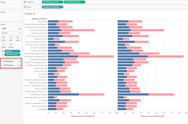
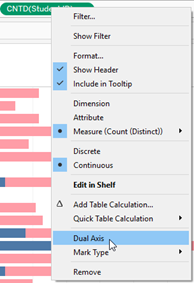
5. Right-click on the second measure and click dual axis.
a. This typically will change the viz to “automatic” and the user will need to change the mark type to a bar again in the mark menu on the left.
6. Click on the axis of the first graph and select synchronize axis. Since the axes are synchronized, hide the second axis.
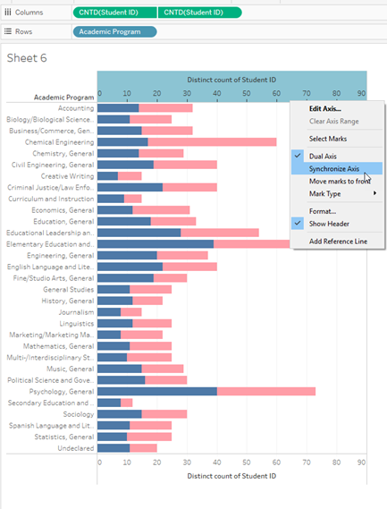
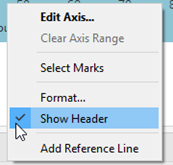
a. To hide the axis, you have to right click on the axis and uncheck ‘Show the Header’.
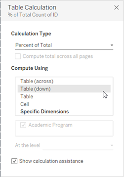
7. Now we can display the gender percentages. Right-click on students count in ‘Marks’ menu and select a Percent of Total from the ‘Quick Table Calculation.’
8. Now we have to edit a Table Calculation. By default, the calculation is computed using Table (down). However, in this case we need to change it to Table (across).
9. We are finished with the preferred formatting and the graph with dual synchronized axis is now ready. The end result is again displayed below.
a. To edit the colors of the graph and to assign new colors you have to go to the mark menu of one of the graphs on the left and edit the colors.
b. If some of the labels are not showing properly, you have to check ‘Show mark labels’ in ‘Label’ which is located in the same mark menu. Depending on how many variables you are using, you might need to check ‘Allow labels to overlap other marks’.
c. You can change the way the labels are displayed as well as the calculations in the graph (e.g you can choose to show percentage on the top of the bar and across all programs etc).

