Supplemental Instruction Survey Report
Supplemental Instruction (SI) is outside-of-class study sessions facilitated by student peers to enhance learning in traditionally difficult gateway courses, such as first-year math, science, logic, or statistical methods. Oxford conducts a survey of students in courses with an SI component each semester to assess the effectiveness of the instruction as well as the individual student peer SI leaders. In the past, the SI data report was a basic chart filled in with frequency percentages for items. Individual students were unable to compare their dis-aggregated data to peer norms. Additionally, it was difficult for the SI program director to quickly make judgments about peer leader and program effectiveness.
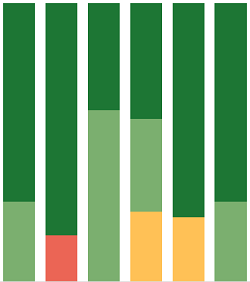
Our IR office recently implemented the data visualization tool Tableau. Because it is a fairly short instrument, the SI survey served as a good project for us to learn how to implement Tableau for survey analysis. The goal of creating a Tableau visualization for the survey was to simplify the data and make it more visually appealing, allowing the director of the program to quickly assess the performance of each student peer leader and overall student satisfaction with the program. Additionally, we created professional-looking individual reports that each student peer leader could use to assess their own strengths and weaknesses.
We encountered some challenges while implementing Tableau’s visualization tools with the SI Survey data, as the typical variables-in-columns/subjects-in-rows data format that most of us are used to working with in other tools does not work as well in Tableau. A helpful resource we found dealing with restructuring survey data for visualization with Tableau can be found at the Data Revelations website.
View the full report.

