Long-term Enrollment Trends
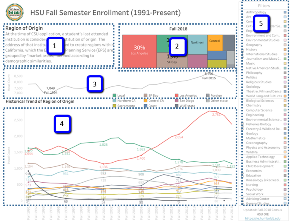
Humboldt State University is one of 23 campuses in the nation’s largest four-year university system, the California State University system. While a formal office of Institutional Research was only founded in 2009, digital data dates back to 1991. Conventional wisdom is to report only the most recent data (e.g., 3 to 5 years). However, to offer the campus easy access to long-term data, a public Tableau workbook was created to show enrollment data from 1991 to present. There are 5 core elements to each tab:
- Plain English definition of the metric of interest.
- Tree map showing the latest data. This also doubles as a color legend.
- Sparkline showing enrollment changes over time.
- Line chart of the metric of interest, presented as either the head count or percent of total.
- The whole dashboard may be filtered by college or department.
See the dashboard live.

