Tailoring Visualizations to Suit Your Audience

Introduction
An effective visualization of data should be relevant to its intended audience and convey meaning. Readers make choices about what they spend time viewing and they won’t spend time reviewing a graphic unless the topic is intriguing to them. Furthermore, if a graphic is overly complicated, readers won’t be able to understand the message that is being communicated. The challenge is that the readers of IR reports vary widely in their level of data literacy, statistical competence, and areas of interest. So knowing your audience is an important first step.
Another challenge facing IR professionals is selecting the right data and the right tools from the myriad options that are available. At many universities, duplicative data sets maintained by different divisions contain similar but not identical data. In others, data definitions may vary from office to office. Both of these situations can lead to confusion and distrust of data when data reports and charts contradict each other.
Using the right visualization tools will also influence the effectiveness of your message. In this digital age, a key question is whether to post a graphic online or create a digital document that can be distributed. For more sophisticated users and complex data sets, an online interactive dataset might be appropriate. For a smaller and simpler data set and a more general audience, presentation software might be adequate.
Thus, by making the appropriate choices, you can make just about any dataset understandable and relevant to any audience. To illustrate this concept, we each created a visualization for a different audience type using the same dataset but different visualization software. The dataset we used was an extraction of graduation rates at 150% completion time from higher education institutions between 2015 and 2019 (IPEDS).
Examples
1. Audience: Sophisticated viewers using Tableau
By creating online, interactive visualizations, not only can you give users the power to find insights based on their individual questions but you can also include more information than in a static visualization. For example, by creating an interactive graduation rate dashboard you can compare your university's graduation rate to any other institution. Users can hover to see additional information as needed. This example uses what is called a jitter plot, which allows you to plot each university's graduation rates in addition to the average graduation rate across all universities, enabling users to see the distribution around the average.
Link to the dashboard: https://public.tableau.com/app/profile/nicole.klassen/viz/SixYearGraduationRatesArticle/Six-YearGraduationRates
2. Audience: Faculty and administrators using PowerPoint
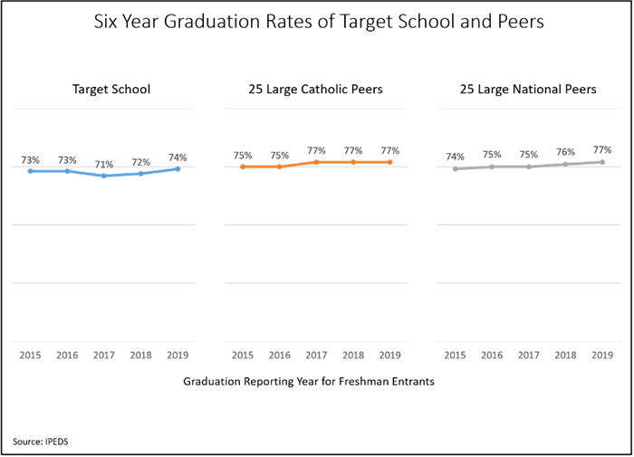
IR professionals can help frame and inform university conversations by sharing information proactively with on-campus committees, such as a student success committee or retention working group. Using Microsoft PowerPoint, you can easily construct and reconstruct presentations for various campus groups, using readily available presentations. Despite its limitations, PowerPoint has several advantages, the most compelling of which are the integration with Excel and the prevalence of the software on university campuses.

3. Audience: General public using Excel
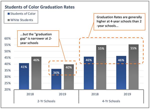
Visualizations for the general public should be less complex and easier to interpret because these end users are unlikely to delve into the details and nuances of a large data set. Also, because they do not think about higher education issues every day, they have less context and may need help identifying the key take-home messages. In the figure below, the two most relevant comparisons are circled and the main conclusions are written in the chart. The advantages of Excel are its ease of use, versatile graphing ability, and prevalence on university campuses.

There is a well-documented difference in graduation rates between white students and students of color. (In this graph the bars represent the % of entering students who graduate within three years for 2-year schools or within six years for 4-year schools.) In 4-year schools nationwide, students of color have a graduation rate that is nine percentage points lower on average than white students. In 2-year schools, the difference is 4–5 percentage points. Source: IPEDS.
4. Audience: Senior leadership using Power BI
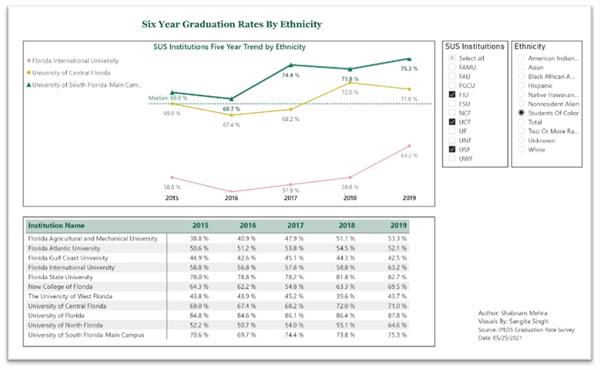
With the growth of analytics, there are dashboards everywhere. Senior leaders are more data driven and universities are moving towards data informed cultures around student success. Visualizations for senior leadership are moving to new self-service interactive data pages. In addition to providing standard static reports, many IR offices now offer the ability to drill down further into the data. Each dashboard includes a collection of charts on the respective topic. The buttons at the top of the dashboard allow you to select the metrics and the filters on the left side provide drill down options. The reports from the dashboards can be easily transferred into PowerPoint or PDF formats for sharing with a variety of audiences.

Conclusion
Our four examples demonstrate how one dataset can be interpreted and presented in very different styles and modalities. Interactive dashboards are powerful tools that allow users to select the data they are most interested in and to run their own analyses based on questions they pose themselves. However, not all users have the inclination or capability to explore a dataset or the baseline knowledge to pose meaningful questions. For those users, a static graphic that addresses questions that IR professionals develop would be more effective in conveying information. Being mindful of your audience and using appropriate tools will give your visualization more impact.
Nicole Klassen is a Senior Decision Support Analyst at Emory University.
Shabnam Mehra is the Director of Student Success Research and Analytics at the University of South Florida.
Liz Sanders is the Associate VP of Institutional Research & Market Analytics at DePaul University.
Jeffrey Simmons is the Executive Director of Strategic Planning and Institutional Effectiveness, as well as a Professor of Environmental Science, at Mount St. Mary’s University.
