Mapping in Tableau
Visualizing geographic information helps data consumers quickly and easily derive insights and meaning. Institutional researchers, for example, may want to map students' home states or countries to help campus administrators understand the how far students travel to college. Tableau is a data visualization software with mapping capabilities that is increasingly common in the analytic tool arsenals of institutional research staff. For offices without Tableau licenses, the company offers a powerful free version, Tableau Public, which can be downloaded from the Tableau website for Windows or Mac.
This post outlines three institutional research-related instances when mapping features in Tableau provide a solution for reporting and analyzing geographic data. The examples are simple in order to demonstrate some basic functionalities in Tableau that apply to institutional research work.
This post does not cover advanced mapping techniques or provide detailed step-by-step instructions; please see the links at the end of the post for additional resources. I created all of the examples described below using Tableau Public, and the related workbooks and data can be found here, including a link to download the files.
Example 1: Mapping Enrollment by Geographic Area
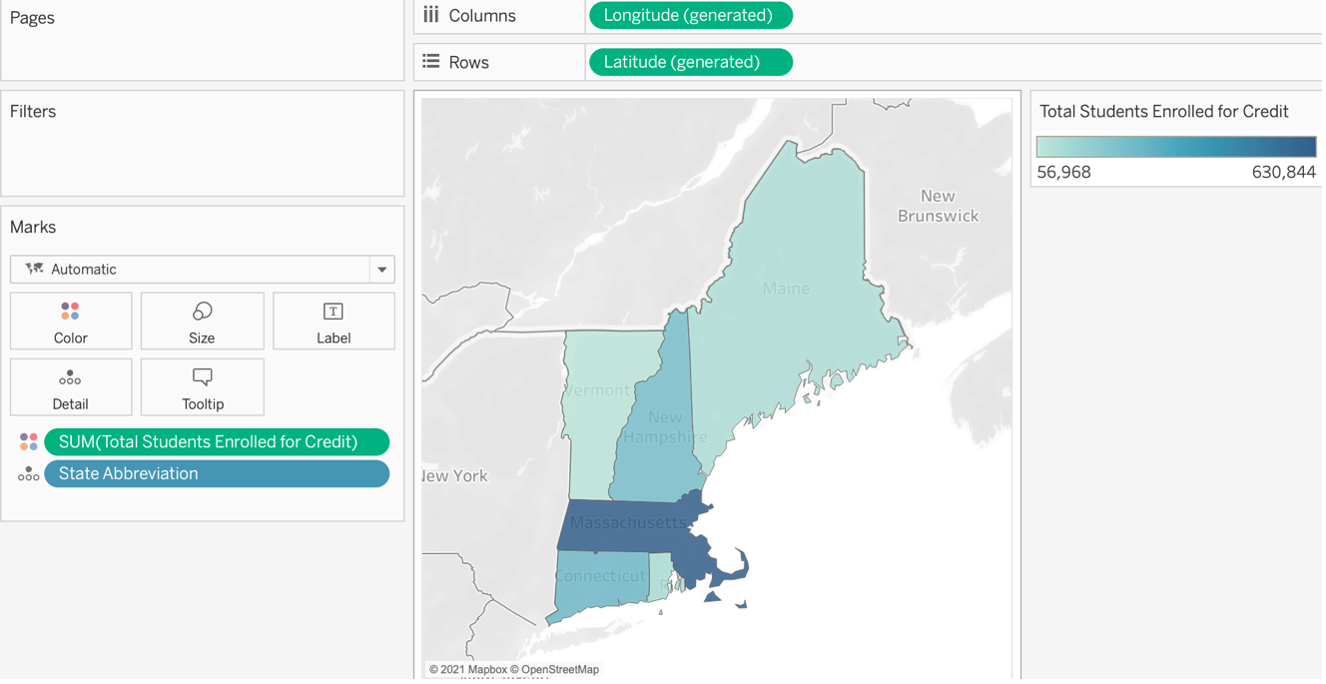
Tableau recognizes country, state, and province names as well as U.S. zip codes, state abbreviations, country codes, and many city names. For a full list of supported map data, click here. The map below indicates the total number of students enrolled for credit in 2019 at New England higher education institutions, by state. A heat map adds a layer of visual information by conveying the total number of students enrolled in state based on the level of shading.
To create this map, three columns of IPEDS data were used: Institution Name and State Abbreviation (from the Institutional Characteristics survey) and Total Number of Students Enrolled for Credit (from the 12-month Enrollment survey). Once the data source is connected, check that the Geographic Role of State Abbreviation is State/Province. If it’s not, change the Geographic role to State/Province. Next, add State Abbreviation to the Detail shelf, which automatically generates latitude and longitude and places these on Columns and Rows. The last step is placing Total Students Enrolled for Credit on the Color shelf and ensuring that this Measure is being summed.

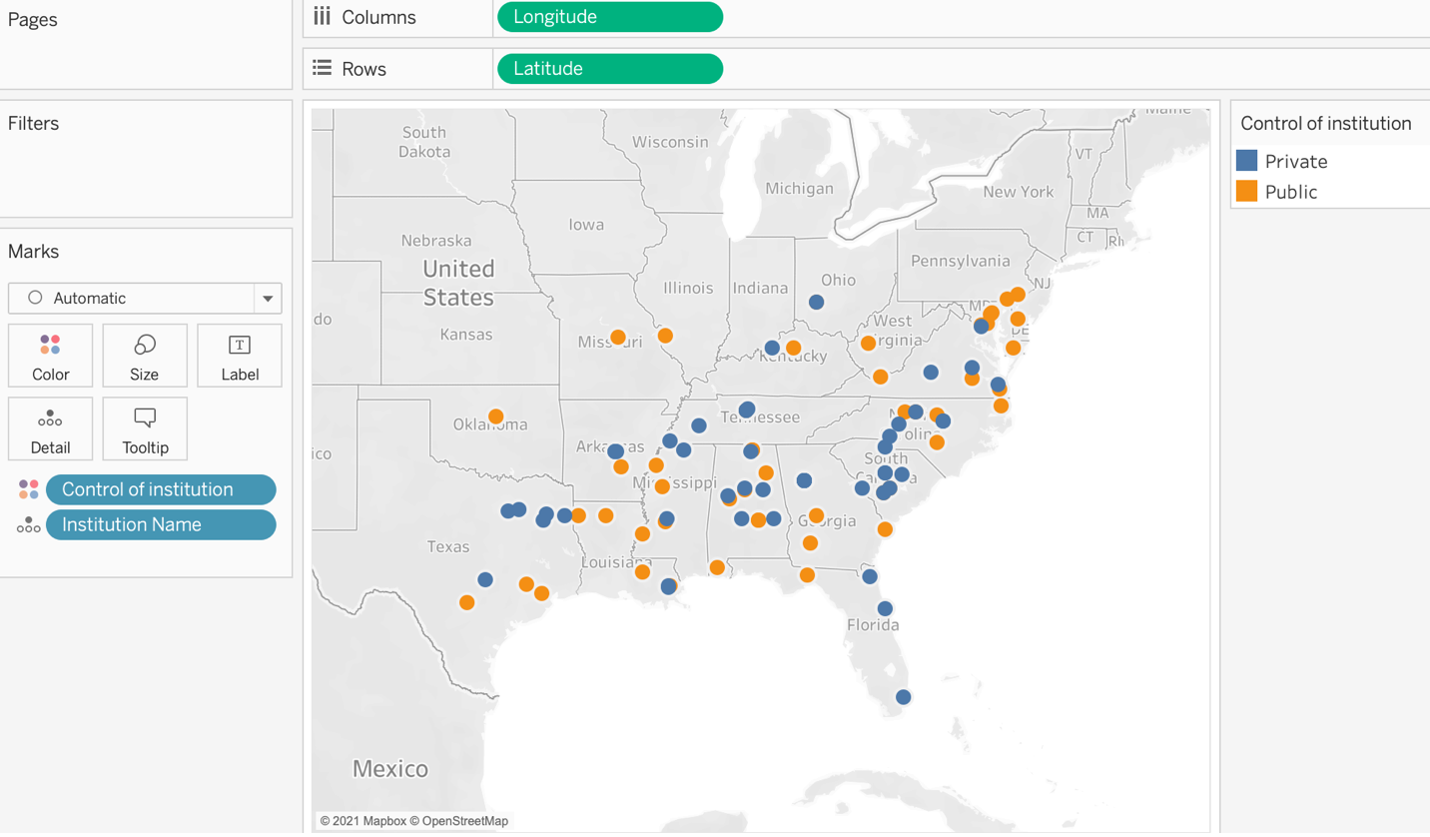
Example 2: Plotting Institution Groups Using Longitude and Latitude Coordinates

Example 3: Using Zip Code to Map Survey Respondent Locations
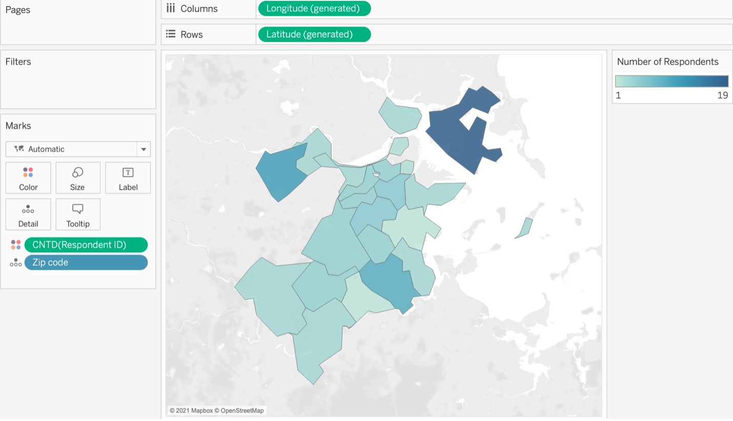
The visualization below depicts the zip code areas where a set of survey respondents are located in the Boston area. The shading corresponds to the number of survey respondents; darker-shaded zip code areas have more respondents than lighter ones.
If zip code information is not available in a data source, longitude and latitude coordinates can be matched to zip code using publicly available data files. Qualtrics, for instance, typically includes longitude and latitude information in data export files, so coordinates can be used to determine respondents’ zip codes. Mapping respondent location using a zip code heat map allows for results to be presented in a more aggregated way that better protects respondents’ identities than individual coordinates would permit.
Additional resources:
- Mapping Concepts in Tableau: https://help.tableau.com/current/pro/desktop/en-us/maps_build.htm
- Get Started Mapping with Tableau: https://help.tableau.com/current/pro/desktop/en-gb/buildexamples_maps.htm
- Build a Simple Map: https://help.tableau.com/current/pro/desktop/en-us/maps_howto_simple.htm
- Build Maps in Tableau: https://help.tableau.com/current/pro/desktop/en-us/maps_build2.htm
- Advanced Mapping Techniques Webinar: https://www.tableau.com/learn/webinars/advanced-mapping-techniques-2019-05-08
Inger Bergom is Senior Data Analyst at Tufts University. She earned a Ph.D. and M.A. in higher education from the University of Michigan.
