
Rollins Class Size Dashboard
Class size matters to different stakeholders on campus for different reasons. Students and faculty love small class sizes for obvious reasons. Administrators like the registrar, deans, department chairs, etc., in smaller colleges have a hard time balancing class capacity with the financial burden of under-enrolling classes. In this battle of providing an optimal learning environment versus providing classroom space efficiency, data can play a key role. Course popularity or faculty preferences cannot be captured in a single visual for an administrator, but a story of inefficient classroom usage or under-enrolling classes can be created by simply presenting class sizes in each department with course details.
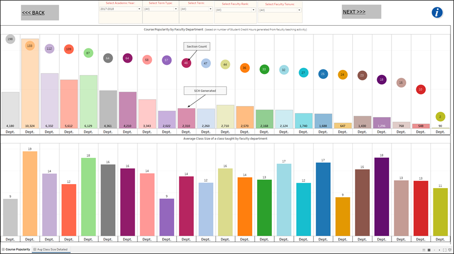
Below is the dashboard that gives leadership and faculty in the administrative roles a good idea of department level efficiencies by using class size and student credit hour generation as the key metrics. There are two main dashboard screens: the first one expresses the popularity of courses by department. I define popularity here by quantifying SCH generation and section counts. The second screen offers a glimpse into the average class size computed for each department. All dashboard screens have multi-select filters for Academic Years, Term, Term type (fall, spring, or summer), Faculty Rank (to only look at courses and class sizes of faculty who are full-professor v/s asst. professor, etc.), and faculty tenure status.

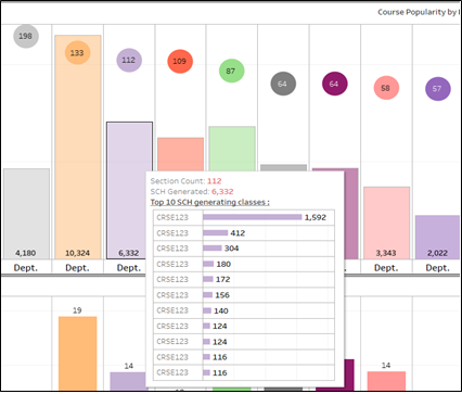 |
The first chart allows the user to see the popularity of courses within departments by the student credit hours generated from the sections offered by the department. The departments here are faculty departments. Users can roll over the bars or the bubbles of the first chart to see the 10 most popular (most SCH generating) classes in that department. |
| The second chart expresses the average class size of the department by offering those sections. This overall view of class size helps administrators understand if, overall, the departments are offering sections with enough seats in them. Users of the dashboard can see explicitly which faculty offer classes with which class size. The user can access the embedded link in the tooltip chart to jump to the detailed dashboard screen which offers further analysis capabilities on class sizes by faculty. | 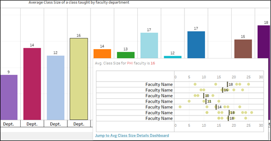 |
 The average class size detailed dashboard screen helps the user see if a faculty has lower than institutional or departmental class sizes. Each bubble on this chart represents one, or more than one, section that was taught with the specific class size expressed on the X-axis. Department can be filtered to see all faculty in a specific department and see if multiple low-enrolling sections were offered by the faculty. In most cases, internship, independent study, or any such sections which are bound to have low enrollment and are not usually considered as part of the faculty load have been removed from the data. Though, due to “dirty“ data, some of these sections which were exclusively not attributed as “independent study” or “internship’ on class schedules can still be seen.
A public version of this interactive class size dashboard has been saved on the Tableau Public site.