Grades Analysis Dashboard: Grades Inflation - Hype or Reality?
Founded in 1919, AUC is a leading English-language, American-accredited institution of higher education and center of intellectual, social, and cultural life of the Arab world. Its community of students, parents, faculty and staff, trustees, alumni, and other generous sponsors represent more than 60 countries.
As we celebrate our centennial, we assess our performance in light of our strategic plan. AUC’s strategic plan has five pillars; the first is Quality of Education. The Provost’s taskforce for quality of undergraduate education identified the issue of grade inflation as one of the barriers hindering good teaching. Among the different initiatives that the Associate Provost for Transformative Learning and Teaching made in order to understand, and dig deeper into the issue of grades inflation, was collaborating with the business intelligence team on building The Grades Analysis dashboard. (View full PDF).
The dashboard has four levels:
- School level
- Department level
- Course level
- Professor level
School Level
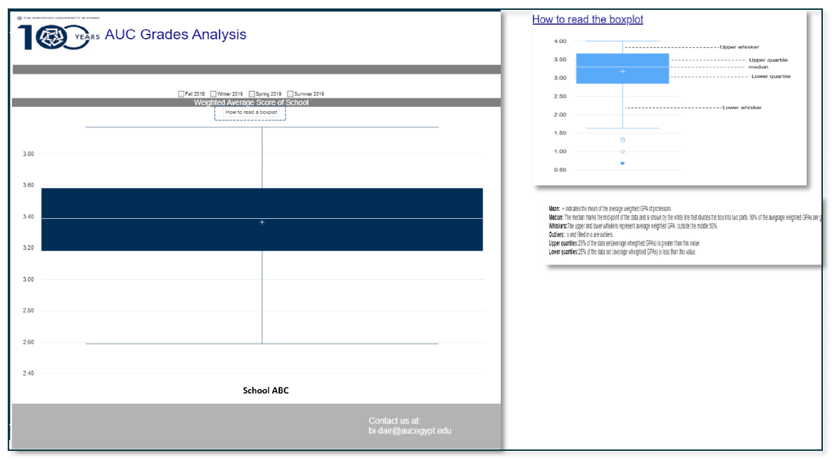
A box plot showing the distribution of average weighted score per instructor within the school. (Figure 1)

Figure 1 - School Level
Departments Level
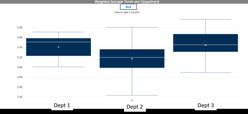
When the user clicks on a school, it drills down to its departments level showing two charts:
1) Blox Plot per department where each box plot is the distribution of average weighted score per instructor within the department.
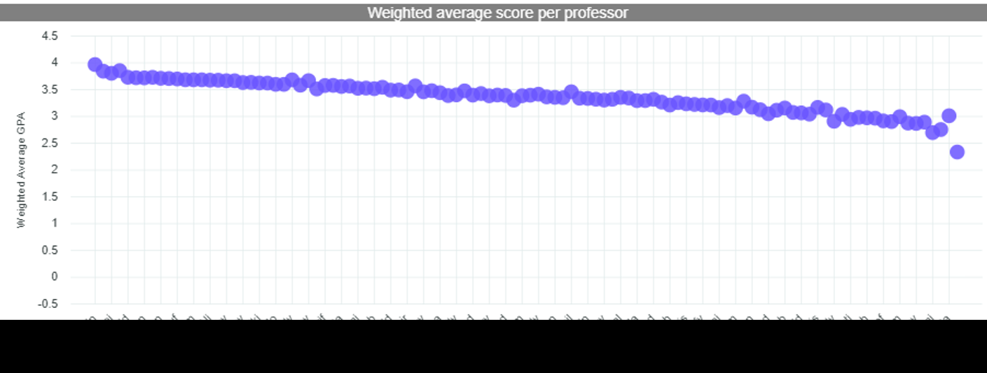
2) Weighted Average Score per Instructor in all departments.

Figure 2 - Box Plot per Department
The user can, at a glance, spot the difference between different distributions in different departments within the same school.

Figure 3 - Weighted Score per Professor
This chart easily shows the weighted average score per professor within the school. The user can easily spot the extreme cases and further request more information for investigation.
Course Level
When a user clicks on a department box plot, they drill down to the level of the courses offered by the department showing:
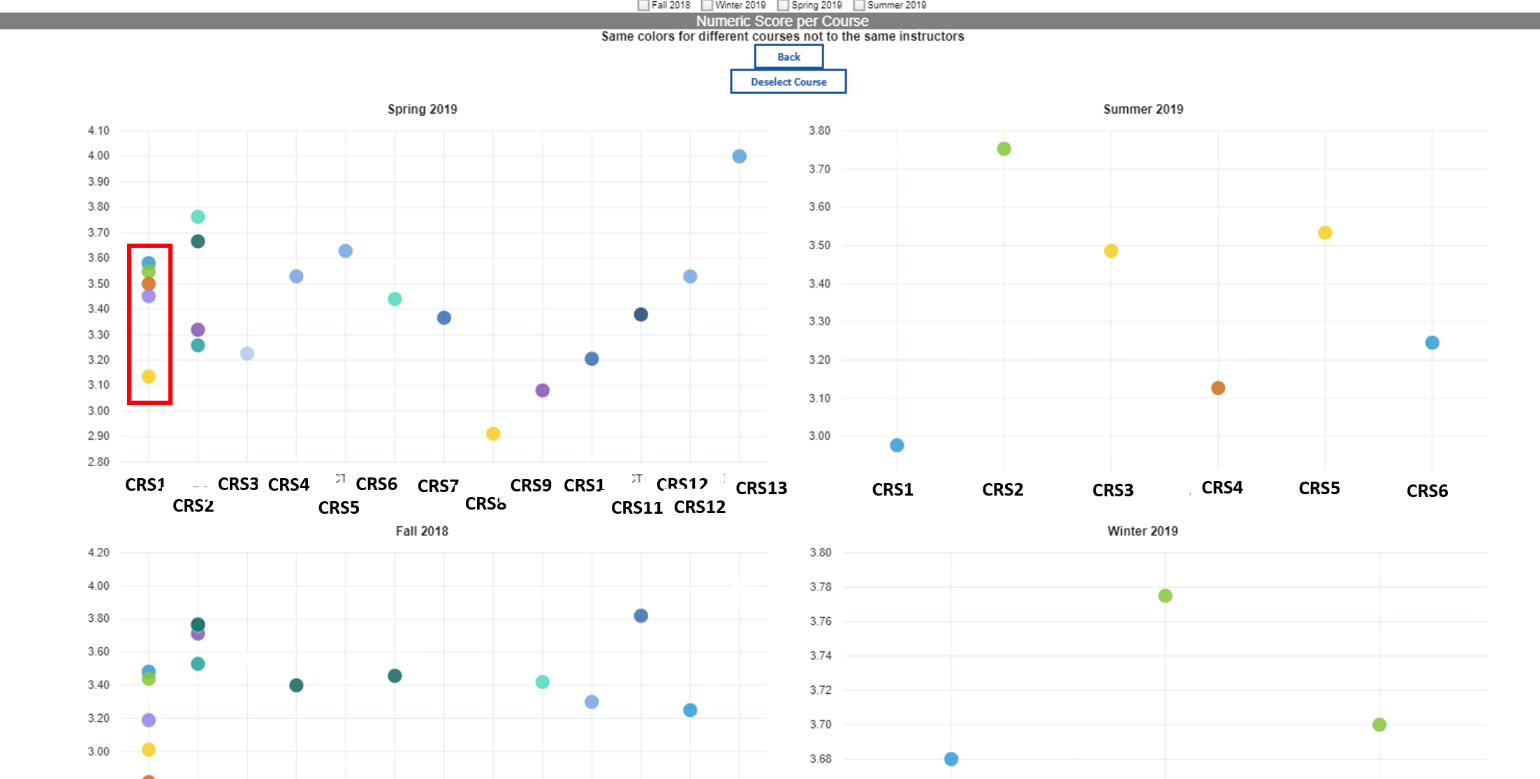
1) For every semester, the courses offered and the average weighted score per instructor per course. (Figure 4)
2) A detailed cross tab will show the courses taught by every professor, total enrollment, %As, %Bs, …etc and the weighted average score per professor. (Figure 5)

Figure 4 - Weighted Average Score per instructor per course
A user can easily spot differences between the grading styles of the different professors teaching the same course. For example, CRS1 is taught by 5 different professors, their average weighted score is denoted by a dot with different color for every professor. It is clear that one professor has a tougher grading style than the others teaching the same course.

Figure 5 - Detailed Cross Tab
Professor Level
On clicking on one professor, the user is redirected to the professor level tab where he can see the grading pattern of the professor in all the courses he/she teaches across the semesters.

Figure 6 - Professor Level
