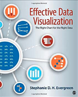
BOOK REVIEW: Effective Data Visualization: The Right Chart for the Right Data, Stephanie Evergreen

As a small IE/IR office always on the lookout for ways to work smarter and tell our institutional story in a concise, accurate, and informative way for any given audience, Stephanie Evergreen’s book, Effective Data Visualization: The Right Chart for the Right Data, fits that niche perfectly.
After hearing Dr. Evergreen present as the opening keynote speaker at the 2018 AIR Forum, her book immediately was added to my MUST READ list. She was such an interesting and engaging speaker, I ordered the book before we even left that session!
Effective Data Visualization did not disappoint. That same voice that was so engaging in her presentation came through in her writing as well. Unlike so many books in this arena, her writing style is very conversational, allowing the reader to feel comfortable and confident with the content, even if this is a new skillset. The book opens with what Evergreen refers to as the “backbone,” or why we visualize data. It is always helpful to get another perspective and set of analogies to add to our resource arsenal, not to mention additional ways to explain to our constituents why not all data points can be represented in a simple bar graph. Every chapter of my copy is marked up with notes in the margins and ideas where a specific visualization tool could be used in my job responsibilities as well as community presentations.
Things I really liked about the book:
- Her writing style, which really does resemble her speaking and presentation, helps to make what can be a very dry topic more palatable.
- Each chapter contains learning objectives at the beginning (always a PLUS for those of us who wear an accrediting and/or assessment hat as well) and real-world examples woven into the text, and concludes with practice exercises, resources, and references. As a side note, I could totally see myself using this as a supplemental text when teaching an Intro or basic Statistics course.
- The inside front cover includes a “chart chooser cheat sheet,” which is helpful in getting the reader/user to think of alternate ways to present data to tell the most compelling and memorable story with their data.
- As one who lives in Excel in my day job, I love her step-to-step guidance on how to build these visualizations within Excel.
- The data “Rockstar rating,” which is in the margin each time a set of instructions is presented, provides a difficulty rating scale in a novel manner. Again—just a nice way to infuse some fun in what could be a dry topic.
- Even though the book leans heavily on quantitative data, it does provide some ideas on visualizing qualitative data in a meaningful way as well.
Effective Data Visualization is now in its second edition, which is in full color, and has two brand new chapters, including how to make interactive dashboards in Excel.
If you are just beginning to start exploring various ways to combine charts and graphs in Excel, or if you have a “go to” chart type that has you in a rut, Effective Data Visualization will definitely provide you with some new ways to look at your data stories.

Christine M. Curry Ross, Ph.D., Associate Dean of Institutional Effectiveness, Hampden-Sydney College.
Christine oversees all things institutional research, assessment, and accreditation for H-SC. When not at work she can be found advocating for PK-20 education, writing, involved in local politics, and practicing her biker chic impressions on open country roads. She can be contacted at cross@hsc.edu.
