
Using HTML Widgets for R to Create Interactive Reports
Institutional researchers are often tasked with synthesizing large amounts of data, perhaps by visualizing it in charts or summarizing it in tabular format. Allowing users to interact with these charts or tables by sorting or filtering, for instance, can reveal trends or highlight a particular subgroup. Many tools allow analysts to create interactive tables or charts. Tableau and PowerBI, for example, are popular in the institutional research community, but these can be expensive and require a server to host and share reports. The R environment is another option for creating interactive visualizations and may be particularly useful for institutional research offices that already use R for data analysis or data management tasks.
Users of R, in fact, have seen many developments in tools for creating interactive data visualizations. John Coene, the author of JavaScript for R (2021), writes, “The R programming language has been propelled into web browsers with the introduction of packages such as Shiny (Chang, Cheng, Allaire, et al., 2021) and R Markdown (Allaire et al., 2021) which have greatly improved how R users can communicate complex insights by building interactive web applications and interactive documents.” This article describes a free set of packages, or “HTML widgets,” to use within the R environment for producing interactive data reports.
What are HTML Widgets?
HTML widgets are R packages using JavaScript (JS) libraries that are not available natively to R. They enable users to create visualizations with interactive features, such as sorting, filtering, and tooltips. While R Shiny apps are powerful and can also produce interactive visualizations, they need to be hosted on a server in order to disseminate, which can add complexity when reports should not be made public. HTML widgets for R, on the other hand, can be used in R Markdown to render an HTML file that can then be shared and opened in a web browser. The underlying, disaggregated dataset is not shared, an important feature when working with sensitive data. Some knowledge of the R programming language is required when using HTML widgets and can be learned through various free online resources and tutorials. The widget features and customization options are not always as robust as paid applications such as Tableau or PowerBI, but HTML widgets for R are free and open source and can be useful tools in the institutional researcher’s analytic toolbox. It is also helpful to keep in mind that because R is open source, users can develop their own HTML widgets and packages to create new functionality that suits their needs.
HTML widgets can be used at the R console or within R Markdown, Quarto, or Shiny web applications. The examples below were created with R Markdown. An R Markdown document combines markdown (a markup language) with “chunks” of embedded R code. The document can be viewed and rendered, or “knitted,” through the RStudio IDE (Integrated Development Environment). It is worth noting that Quarto is the recently released successor to R Markdown and supports languages besides R, such as Python and ObservableJS. However, R Markdown is still available to use.
Examples of HTML Widgets
Although others are worth exploring, this section highlights a few of the HTML widget packages available: DT, ggplotly, crosstalk, leaflet, and flexdashboard. To view the interactive sample reports linked below, click on each link which takes you RPubs where the sample reports are published.
DT
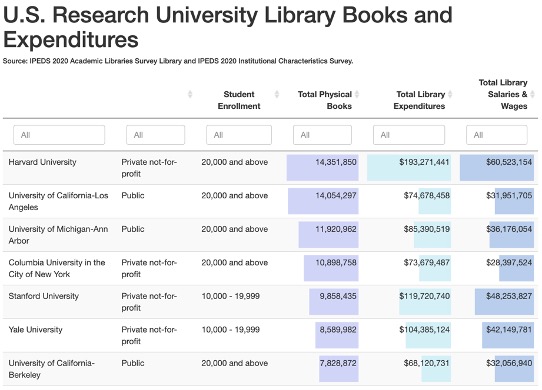
Interactivity is not only useful for graphs or charts but also can improve the user experience for data tables. The DT package provides an R interface to the JavaScript library DataTables and supports creating interactive tables. Tables can be sorted, searched, filtered, and customized in appearance and pagination specifications. The example linked to below is a table of information from the IPEDS 2020 Academic Libraries Survey Library and IPEDS 2020 Institutional Characteristics Survey.
ggplotly
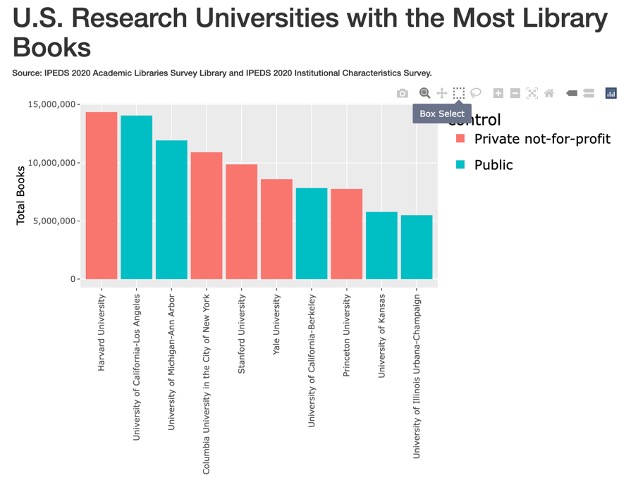
Many people who work with R for data analysis use the powerful ggplot2 package to create graphs and charts. ggplotly converts a ggplot2 object to a plotly object. plotly is a graphing library for making interactive, high-quality graphs. In the example below, a ggplot2 object showing a bar chart of university library book counts was passed through ggplotly to create a plotly chart. plotly interactive control buttons are displayed in the top right, and users can also click on the legend categories to filter for those groups.
crosstalk and leaflet
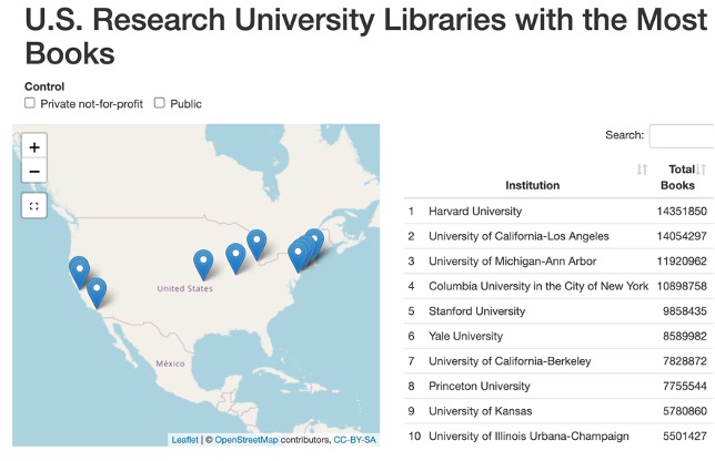
Crosstalk is an add-on to HTML widgets that enables cross-widget interactions. This means, for instance, that filtering a table created with one widget would simultaneously filter a figure created using a different widget, if the table and figure were connected using crosstalk. The example below uses crosstalk to link a table created with DT and a map generated using leaflet, a package for creating interactive maps. Selecting “Control” type (private or public) filters both the map and table. Clicking on rows of the table will filter the locations displayed on the map.
Flexdashboard
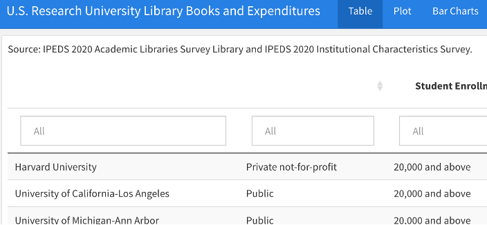
Flexdashboard enables the creation of a single data dashboard containing separate sections or tabs. Charts, tables, or text can be arranged on a page in columns, rows, and tabs or presented as a storyboard sequence. Several sample projects with source code are available here.
Publishing and Sharing Reports
The visualization, table, or dashboard generated using HTML widgets can be rendered as an HTML file using R Markdown or Quarto. The HTML file can then be sent as an email attachment or uploaded to a shared drive, similar to sharing a Word or Excel file. The HTML file opens in a browser on the user’s local computer. Alternatively, reports can be published to a website or server, but in those cases permissions for non-public reports need to be managed through the server or website.
Resources
Many resources are available online for learning the packages described above, as well as R, R Markdown, and Quarto. Here are just a few:
- HTML Widgets Gallery: http://gallery.htmlwidgets.org/
- DT: https://rstudio.github.io/DT/
- leaflet: https://rstudio.github.io/leaflet/
- crosstalk: https://rstudio.github.io/crosstalk/
- flexdashboard: https://pkgs.rstudio.com/flexdashboard/articles/examples.html
- R Markdown: https://R Markdown.rstudio.com/
- R Markdown Cookbook: https://bookdown.org/yihui/R Markdown-cookbook/
- Quarto: https://quarto.org/
 Inger Bergom is a senior research analyst in the Office of Institutional Research at Harvard University. She earned a Ph.D. and MA in higher education from the University of Michigan, specializing in evaluation and assessment, learning and teaching, and faculty work.