Creating Institutional Diversity Dashboards: Where Do IR Offices Start?

Attention to diversity, equity, and inclusion (DEI) in higher education has intensified in recent months on many campuses. Increasingly, institutional leaders acknowledge that advancing social justice requires involving everyone on campus, not only Chief Diversity Officers or those with the explicit charge of promoting equity and inclusion. Like everyone else on campus, institutional research staff have a part to play. One pivotal way IR offices are involved in DEI efforts is in the design and creation of institutional DEI dashboards. These dashboards serve various audiences but have the same underlying goal: to make meaning out of institutional data in order to advance diversity, equity, and inclusion at our institutions.
Inequality and social injustice are complex, thorny problems without simple solutions, and DEI dashboards can provide a starting point for understanding and addressing the issues. In June 2020, Miami University in Ohio set out to build a dashboard of its own. The Office of Institutional Research and Effectiveness was instrumental in development and organization of the dashboard. In this article, we discuss measures and data used in institutional DEI dashboards, suggest best practices and design considerations, and offer examples from a DEI dashboard currently being used to support DEI efforts at one university.
A Case for a DEI Task Force
Miami University, a public liberal arts university serving almost 20,000 students located in Ohio, created a special task force in June 2020 that was charged with advancing DEI. Five pillars served as focus areas for the task force that would also result in recommendations to the President and the President’s Executive Committee. Read the full charge to DEI Task Force. For Miami’s Office of Institutional Research and Effectiveness (OIRE) this meant gathering current and historical data from several sources and delivering in such a way that was both informative and actionable.
Organization of a DEI Dashboard
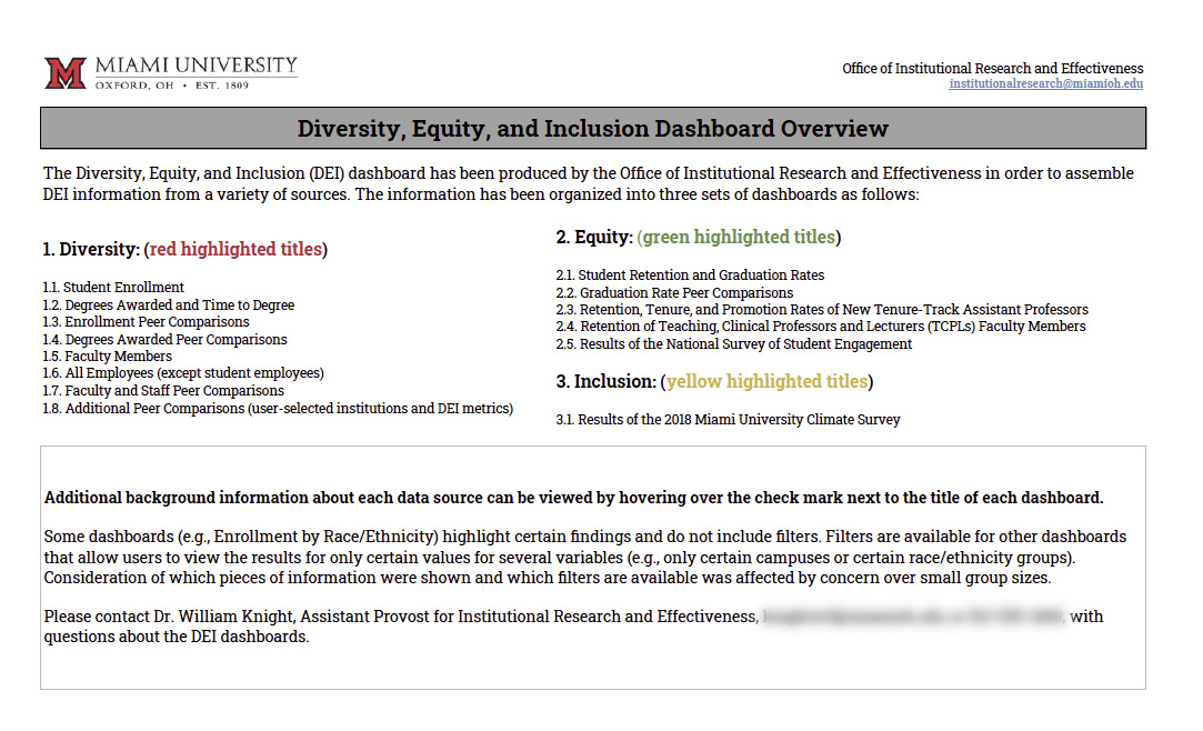
Miami University utilized Tableau to create several dynamic dashboards for internal use that enabled interactive exploration and allowed the end-user to filter groups and adjust measures and breakout categories. Miami began with organizing the dashboards into three views with color coded titles to indicate whether the visualization focused on assessing diversity, equity, or inclusion. Each section of the dashboard presented data for the previous five years or more.
1. Diversity: (red highlighted titles)
1.1. Student Enrollment
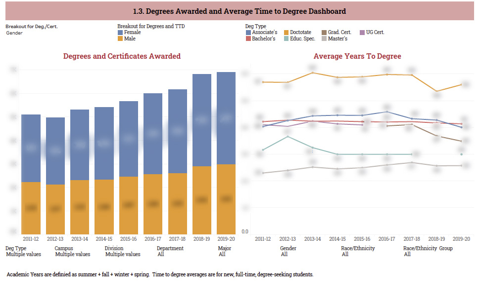
1.2. Degrees Awarded and Time to Degree
1.3. Enrollment Peer Comparisons
1.4. Degrees Awarded Peer Comparisons
1.5. Faculty Members
1.6. All Employees (except student employees)
1.7. Faculty and Staff Peer Comparisons
1.8. Additional Peer Comparisons (user-selected institutions and DEI metrics)
2. Equity: (green highlighted titles)
2.1. Student Retention and Graduation Rates
2.2. Graduation Rate Peer Comparisons
2.3. Retention, Tenure, and Promotion Rates of New Tenure-Track Assistant Professors
2.4. Retention of Teaching, Clinical Professors and Lecturers (TCPLs) Faculty Members
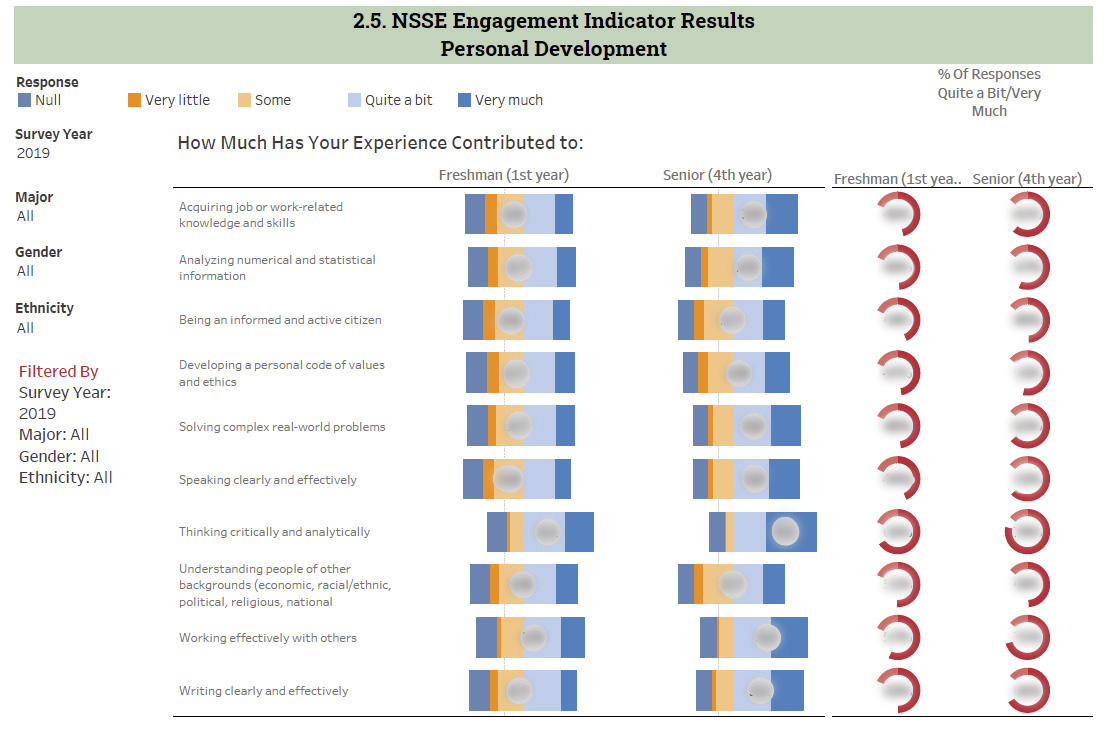
2.5. Results of the National Survey of Student Engagement
3. Inclusion: (yellow highlighted titles)
3.1. Results of the 2018 Miami University Climate Survey
What Should You Consider First in Developing a DEI Dashboard?
DEI dashboards vary in scope and design and should serve the specific college or university where they are developed. The audience and purpose will dictate which measures and breakout categories to incorporate into the dashboard. DEI dashboards often feature compositional characteristics of members, student outcomes, or survey feedback from campus stakeholders. Understanding the driving factors for analysis first will help guide the design of the data and answers to be given in the dashboard. Simply throwing up a table or chart of diversity is not answering the true questions or analysis needed for DEI.
While creating dashboards about these three types of measures—composition of community, outcomes, and survey feedback—consider the following variables as filters and breakout categories, with headcounts and/or proportions as units.
- Employee Type (e.g., Salaried or Hourly; Faculty or Staff)
- Campus (e.g., Geographic or Distance)
- Division/College
- Gender Identity
- Race/Ethnicity (e.g., IPEDS categories or all races selected)
- Race/Ethnicity Group (e.g., Domestic, International, Unknown and White)
- Age Range
- Sexual Identity
- Student Level (e.g., Associate, Undergraduate, Graduate)
- Program or Degree
- Residency (In-State vs. Out-of-State)
- Faculty rank or role (e.g., Tenured, Tenure Track, Affiliate/Adjunct, Clinical, Research)
- Peer Group Comparison
- First Generation College Student Status
- Student Income Level (e.g., Pell receipt status; student financial aid status)
Best Practices and Design Considerations
DEI dashboards vary based on institutions' needs, but the following are best practices and design decisions to consider when developing a dashboard.
Who Should be Represented?
Higher education communities include various constituents: students, faculty, staff, alumni, administrators, trustees, incoming/admitted students, residents of the surrounding community, and more. Dashboards should be specific and inclusive when representing these groups. For example, “faculty” typically encompasses many different roles that vary tremendously by responsibilities, promotion and reward systems, and level of inclusion in decision making. Therefore, dashboards about faculty are most meaningful when faculty are disaggregated, such as by role or rank. A recent examination of national data on scholars of color by rank, for example, revealed that faculty of color "occupy the most vulnerable faculty positions" after data indicated "Hispanic faculty members are most likely to hold instructor and lecturer roles, and Black faculty members are most prevalent in positions with no academic rank." Miami University's institutional DEI dashboard, presents faculty retention information separately for tenure-track faculty and non-tenure-track faculty, defined by the MU community as teaching faculty, clinical faculty, and lecturers.
How Should Groups Be Labeled?
The language we use to describe groups of people is powerful, so thoughtfully labeling categories and even choosing color schemes used in our dashboards is essential. For example, we should use humanizing language to describe categories of people, such as international students instead of non-resident aliens. How do we know what language is appropriate or inappropriate? One way is to ask, for example through focus groups. Or we can stay abreast of research that asks students how they perceive their own racial identities (e.g., Stewart, 2009) and how they think about the identity categories we ask them to choose from (e.g., Johnston, Ozaki, Pizzolato, & Chaudhari, 2014).
How Should Data Be (Dis)aggregated?
Interactive dashboards often allow users to customize the extent to which the people represented can be disaggregated into finer-grained groups. When sample sizes are large enough to maintain confidentiality, try to give dashboard users the option to disaggregate identity categories into smaller groups. For example, in some cases Korean American and Indian American could be disaggregated instead of grouping them with “Asian American.” Often, grouping people into broad racial categories overlooks various cultural and social identities represented by this group and obscures differences in educational opportunities and outcomes across subgroups (Teranishi, 2007).
Data Storytelling and Wrapping It Up
Ultimately, effective DEI dashboards tell stories with data. We leave you with four key principles (the “4 As”) for effectively building dashboards and data visuals, offered by Knaflic (2015) in Storytelling with data: A data visualization guide for business professionals. These principles include:
- Affordances: Aspects inherent to the design that make it obvious how the data is to be used.
- Accessibility: The designs should be usable by people of diverse technical abilities (digital vs. non-digital natives).
- Aesthetics: Make it pretty—more aesthetically pleasing designs are perceived as easier to use/interpret.
- Acceptance: For a design to be effective, it must be accepted by its intended audience.
Using the four key principles and considering the design questions above will start the process of creating DEI dashboards that can help drive improvements and narrow the focus for taskforce members and campus leadership.
Sample Dashboard Views

References
Dam, R., & Siang, T. (n.d.). 5 stages in the design thinking process. Retrieved January 08, 2021, from https://www.interaction-design.org/literature/article/5-stages-in-the-design-thinking-process
Dykes, B. (2019, December 20). Data storytelling: The essential data science skill everyone needs. Retrieved January 08, 2021, from https://www.forbes.com/sites/brentdykes/2016/03/31/data-storytelling-the-essential-data-science-skill-everyone-needs/#1e00074652ad
Harris, J. C., Barone, R. P., & Davis, L. P. (2015). Who benefits?: A critical race analysis of the (d)evolving language of inclusion in higher education. Thought & Action, 21-38.
Harris, T. M. (2020). Dismantling the trifecta of diversity, equity, and inclusion: The illusion of heterogeneity. In H. Oliha-Donaldson (Ed.), Confronting equity and inclusion incidents on campus: Lessons Learned and Emerging Practices. Taylor & Francis.
Johnston, M. P., Casey Ozaki, C., Pizzolato, J. E., & Chaudhari, P. (2014). Which box(es) do I check? Investigating college students’ meanings behind racial identification. Journal of Student Affairs Research and Practice, 51(1), 56-68.
Knaflic, C. (2014, February 10). Storyboarding. Retrieved January 08, 2021, from http://www.storytellingwithdata.com/blog/2014/02/storyboarding
Knaflic, C. N. (2015). Storytelling with data: A data visualization guide for business professionals. Hoboken, NJ: John Wiley & Sons.
Popova, M. (2015, November 11). How to write with style: Kurt Vonnegut's 8 keys to the power of the written word. Retrieved January 08, 2021, from https://www.brainpickings.org/2013/01/14/how-to-write-with-style-kurt-vonnegut/
Stewart, D.-L. (2009). Perceptions of multiple identities among Black college students. Journal of College Student Development, 50(3), 253–270.
Teranishi, R. T. (2007). Race, ethnicity, and higher education: The use of critical quantitative research. New Directions for Institutional Research, 133, 37–49.
Inger Bergom is Senior Data Analyst at Tufts University. She earned a Ph.D. and M.A. in higher education from the University of Michigan. Views presented are her own and do not represent those of her employer.
Mollie Miller is the Associate Director for Institutional Research and Effectiveness at Miami University. Mollie is a current candidate for the degree of Doctor of Philosophy in Interdisciplinary Studies majoring in Educational Studies. Mollie currently serves as President for the Ohio Association for Institutional Research and Planning and a sector four-year public representative.
The authors thank Christina Butler, Dr. William Knight, and the eAIR Editorial Board for their feedback on previous versions of this article.


