Tech Tips

  • Tech Tips
  • 09.17.19

Side-by-Side Comparison Charts

  • by Terry McCamish, Accountability Data Analyst, Technical College System of Georgia

Figure 1. Ethnicity Table

Figure 1. Ethnicity Table

The columns I used for the chart were Ethnicity, Georgia Percentage Positive, Georgia Percentage, and College Percentage (Figure 2). Excel 2016 is the software used to construct the chart. The percentages are the category count divided by the sum of all categories. Naturally, the amounts are going to be all positive. For a side-by-side chart, one of the columns needs to be negative so that the bars will go the other way. My sources were US Census Bureau for the Georgia population data and the Technical College System of Georgia data from the state Knowledge Management System. 

Figure 2. Selected Columns of the Table

 Figure 2. Selected Columns of the Table

The first step is to construct a 2-D bar chart with the four columns. It looks like this: 
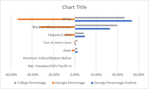
Figure 3. Initial 2-D Bar Char
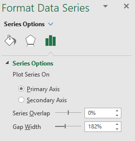
 Figure 3. Initial 2-D Bar Char

Figure 4. Format Data Series Pane 
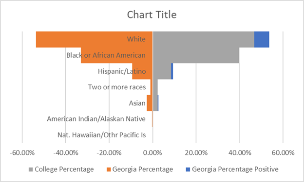
Figure 4. Format Data Series Pane

This isn’t exactly what we want, so select one of the data series and right-click to bring up the options menu and then select Format Data Series. This is how the Format Pane looks in Excel 2016. What we are going to do here is change the Series Overlap and Gap Width. The Series Overlap is set to 100% and the Gap Width is set to 0. See the results in Figure 5.
 
This widens each bar. On the right side the bars for Georgia Percentage Positive and College Percentage are completely overlapped.The Georgia Percentage Positive only shows if it exceeds the College Percentage (see below). The chart isn’t quite ready yet, but it is getting there.
 

Chart Progress: 2018 Georgia Population with High School or Less Education vs. AY 2018 TCSG Enrollment by Ethnicity

Figure 5. Table View 3
 
 The Ethnicity axis needs to be moved to the left. Select the axis labels and right-click to find the Format Axis pane.

Figure 6. Format Axis Pane

Figure 6. Format Axis Pane

The changes we want to make are at the top where we will check the box next to Categories in reverse order and at the bottom under Label Position. See figure 6.

The options are: Next to Axis, the default; High, Low, or None. For the y-axis “High’ will place it outside the plot area on the right-hand side. Low will place the text outside the plot to the left. That is the option I choose.

Now the chart looks like this: 
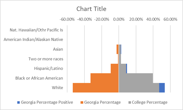
Figure 7. View 3 of the Chart
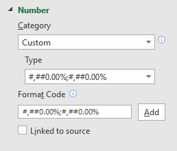
Figure 7. View 3 of the Chart

Our chart is still not there. Now we can get rid of the data series Georgia Percentage Positive. That leaves us with just Georgia Percentage and College Percentage. The other axis also needs fixing as we don’t want negative numbers. Select the x-Axis and open the Format Axis pane. ( See Figure 8) This time we will select the Low option under Label position. That will put the text on the bottom of the plot area. This is also where we will fix the scale to get rid of the negative numbers.


Figure 8. Custom Number X-axis Format

Figure 8. Custom Number X-axis Format

Expand the Number format area. Under Category select Custom. In the Format Code text box put:

#,##0.00%;#,##0.00%

Click the Add button. Now the axis starts at 0 and has positive numbers extending on both sides.

The only thing left to do now is put in the Chart Title and format the legend.

Below is the finished product. 
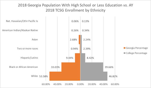
Finished Product 2018 Georgia Population with High School or Less Education vs. AY 2018 TCSG Enrollment by Ethnicity

This chart was distributed to those involved in building the Perkins V Transition Plan.

Back to Tech Tips