Creating Animations in R
If you’re looking for an excuse nowadays to spend more time inside on a computer, I recommend visiting the subreddit r/dataisbeautiful. Users submit all kinds of visualizations along with details of how they were created. It’s a great source of inspiration to add to your visualization toolbox.
Many of the most popular submissions on this subreddit are animations. While a website like Reddit may lend itself more easily to the animation format than our typical world of PDF, Excel, and dashboards, I think it can and should be used to explore your data in IR. Animations can often lead to insights other visualizations would struggle to convey. In formats where they work, they can liven up any presentation of data.
There are numerous free and paid ways to create animations, but today we’ll look at how to create a visualization using R and the packages ggplot2 and gganimate. All data and code for these examples are available here.
Data Structure
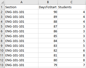
First, we’ll need to make sure our data is in the long format. We are basically just creating dozens or hundreds of different graphs, and we need a column that differentiates one chart from another. In our case, this would often be something like day, term, or year. For our example, we’ll look at how sections of a course fill up over time, so the column we’ll be animating across is “DaysToStart.”
Reading in The Data Files
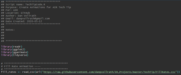
First, we are going to read in the packages we’re using for this project. We use readr to read in our csv file from GitHub, ggplot2 to create our base graphic, and gganimate to add animation features to our plot and save our animation.
Next I use the functions ‘read_csv’ and ‘url’ to read in a file I’ve stored in one of my GitHub repositories. Feel free to use this data for yourself if you’d like to run this code on your own.
Creating Our Animation
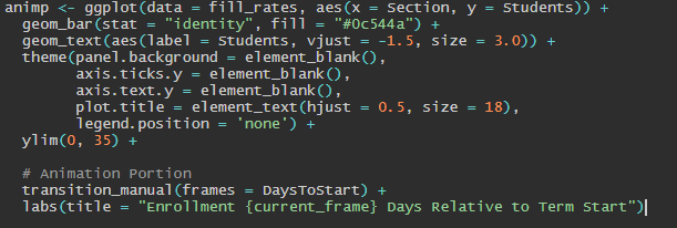
We’re now going to create an animated plot object called “animp.” The first portion of this code should look familiar to someone with experience with ggplot2. For those without experience, here’s a quick breakdown:
Line 1, ggplot: identifying our data object and setting the x and y axes.
Line 2, geom_bar: creates a bar chart object, we want to use the field as-is with “identity”, and we fill with a specific color.
Line 3, geom_text: sets our data label, we adjust it updward with ‘vjust’, and set the size.
Line 4-8, theme: customizes our theme. Themes are the non-data portions of our plot. There are prebuilt themes within ggplot and many others in packages like ggthemes.
Line 9, ylim: Sets the limits of our y axis.
If you ran this section of the code alone, the resulting chart would be useless. That’s because you’re giving about a hundred points of data to each “Section” without differentiating them. That’s what we’ll be doing in the next portion of code. Ggplot is a limitless tool for visualizing data. The chart I’ve created here is simple, but anyone interested in learning more about ggplot2 should check out the fantastic support that’s available online.
The second portion of this code builds our animation. We’re using “transition_manual” and telling the function that we want a frame for each ‘DaysToStart.’ We’re also using the “labs” labelling function, from ggplot2, to set the title. We’re imbedding {current_frame} into our title that will show which day we’re on in the animation. There are different methods for accomplishing this task, each with their own variation. You can check out the full R code for examples using the function “transitions_state” and the frame variable {closest_state}.
The next line of code renders our “animp” object into an animation. We’re telling the function how many frames we want, how fast the animation will go with the “fps” parameter, and how many frames we want the animation to pause on for the last frame. This section usually takes some testing and adjustments to create an animation that allows viewers to get the most information.

 Finally, we’re going to save our animation using “anim_save”. This function works in much the same way as “ggsave”, for those familiar with ggplot2. I’m saving our animation as a “.gif”, though there are other formats possible. I’m also setting the width and height.

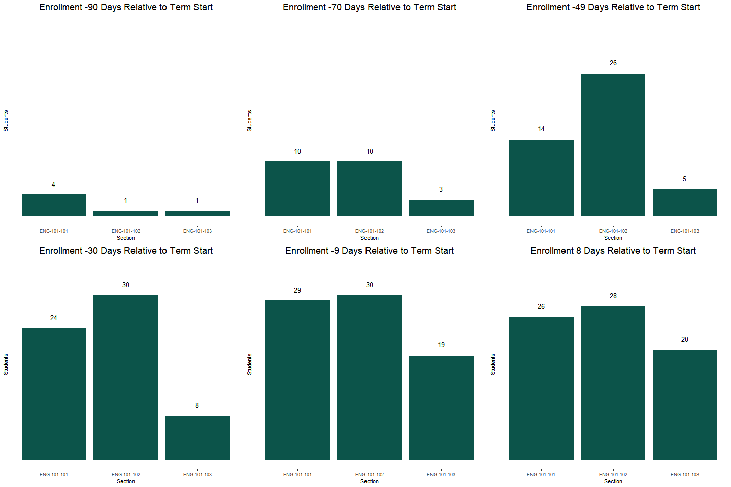
This GIF could now be shared directly, inserted into a PowerPoint presentation, or added to a website. For those familiar with R’s markdown, GIFs could be created and knitted into HTML format as part of a larger presentation. The code, with a few adjustments, could also be wrapped into a loop to create and save multiple GIFs at once.
Summary
Although we used a simple example in this tech tip, the variations allowed within gganimate are immense. It will probably take some trial and error and adjustments to get a visual you’re happy with. However, my hope is that from this example you take away that it doesn’t necessarily take a lot of extra code to go from a static chart to an animation. I also hope that that this tutorial may spark some ideas for new ways to visualize data within our community.
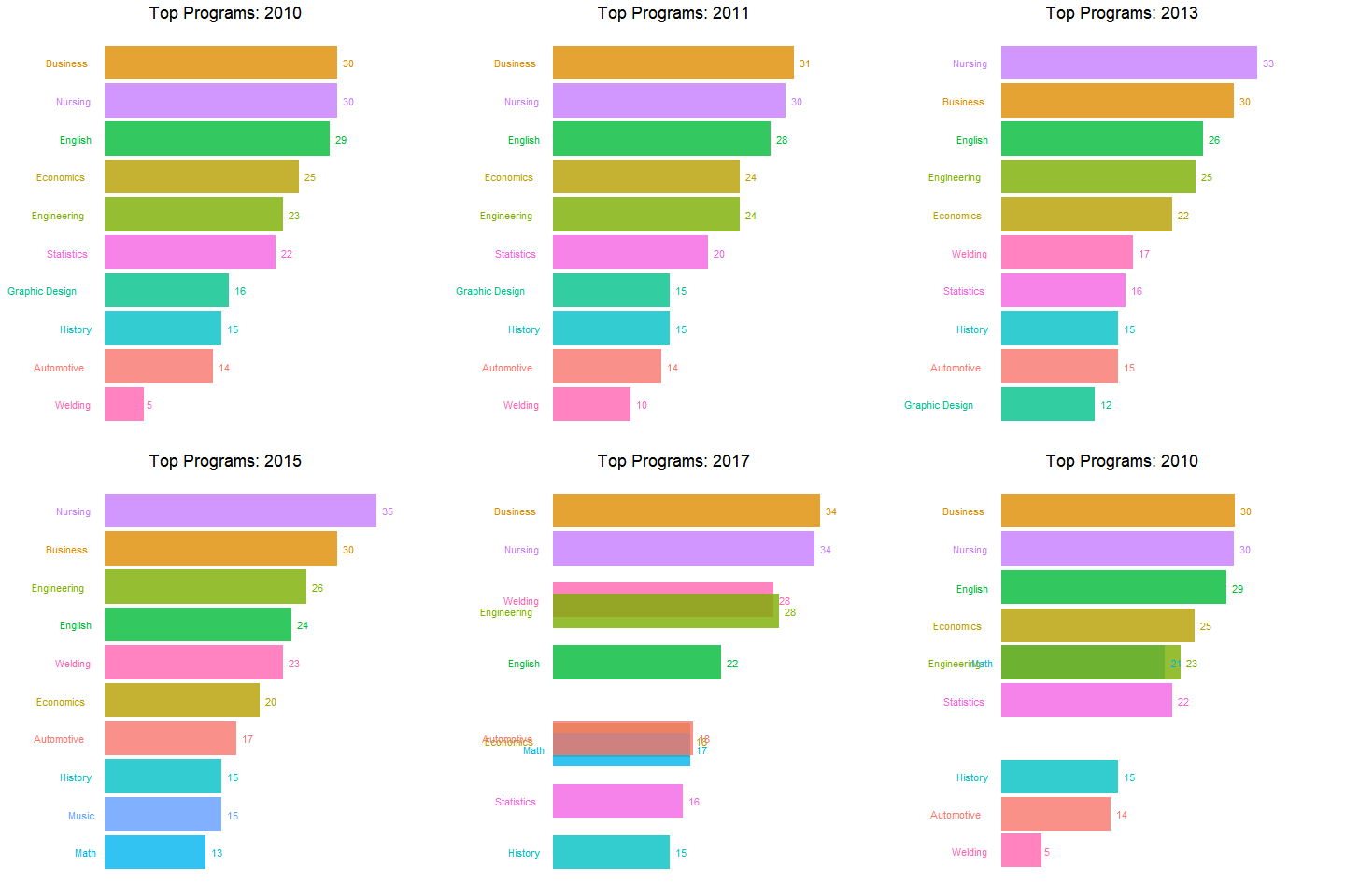
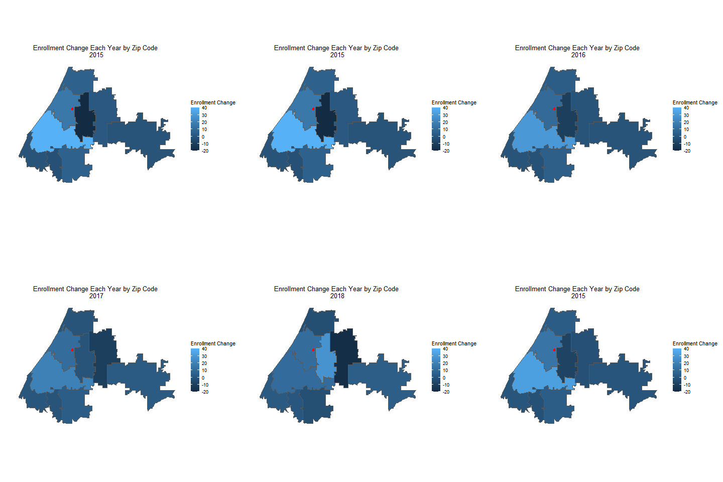
Other Examples
Resources
1. gganimate.com
2. ggplot2.tidyverse.org
3. Helpful video from the Chicago Data Viz Community, featuring Stephanie Kirmer
