Using Images as Data Points in Excel Column Charts
There are many features in Microsoft Excel that go unnoticed. One of these features allows you to add flair to your data visualization with relative ease. When creating column charts in Excel, we often utilize the default palette of colors to represent data. If we do vary from this, it is usually to add shading or a transparency. Other than that, most of our column charts look very standardized and don’t differ drastically. This tip allows you to tap into your creative side and help make a lasting impression on your audience.
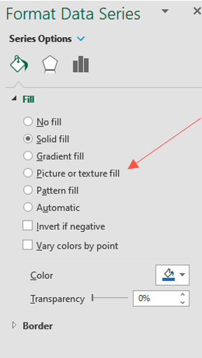
When formatting a data point in a column chart in Excel, the default selection is usually set to “Solid fill” (Figure 1). You will notice that one of the options is "Picture or texture fill.” This option allows you to use a picture to represent either a data point or a series of data points in your column chart. Select this option to create your column chart.
Figure 1
To illustrate this tip, let’s use a small data set of SAT scores of select students from a certain high school. We would like to visually compare these seven students’ SAT scores, the data set for which is represented in Figure 2.
Figure 2

The most common approach would be to click “Insert” on the Excel ribbon and then choose the column/bar chart icon as seen in Figure 3. Next, we would choose a simple 2-D clustered column chart, which would result in the very standard column chart seen in most data visualizations, represented in Figure 4.
Figure 3

Figure 4

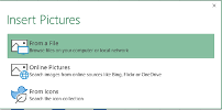
In order to use images for each student in the column chart, we must select each data point individually. In Figure 5, I have right-clicked on “Zack,” revealing a new menu. I need to select “Format Data Point” and, after doing so, the Format Data Point menu will appear on the right side of the screen (Figure 6). I must now select “Picture or texture fill” and “Insert” under the “Picture source” heading. This triggers the pop-up “Insert Pictures” menu, allowing me to select my image source (Figure 7). I know that my pictures are in a file located on my desktop, so I will choose the first option, “From a File,” and then select the appropriate picture. I then have the option to stretch, stack, or stack and scale my inserted image. Your choice will depend on the context associated with the data point.
Figure 5
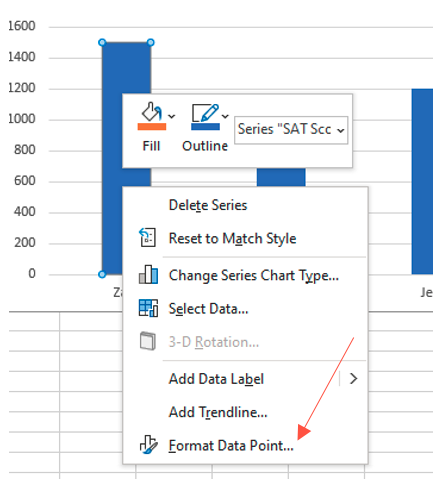
Figure 6
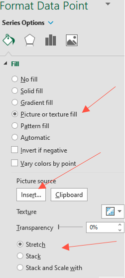
Figure 7
After completing these steps, I ended up with the output that is in Figure 8. I then repeated these steps for each of the data points for which I wished to have pictorial representation. Further cleanup may include editing the width of the columns and adding data labels.
Figure 8
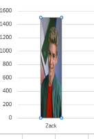
After all my revisions, the outcome is represented in Figure 9.
Figure 9

Adding pictures to represent column data can be used to emphasize a context associated with the data. For example, you may use flags to represent country of residence or icons to represent specific sports. This is a small, yet unique and unexpected way to create reports, visualizations, or presentations that will resonate with your audience.
