Visual Guide to STP Enrollment Dashboard in Tableau
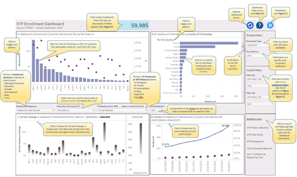
Figure 1: STP Enrollment Dashboard
Introduction
Tim Miller, a blogger for DataViz at Data Science Central, recently offered suggestions for Creating a Great Information Dashboard. He nicely summarized some of the most important features of dashboards.
"Dashboards are where these charts can work together to reach their full potential. Multiple, related information visualizations working together, where the charts can all be consumed almost simultaneously. Without any distraction from having to scroll to another part of the window or having to change between screens or tabs in web browsers. Dashboards are the pinnacle of information presentation systems providing support for organizational decision-making activities. A well-crafted and successful dashboard makes a decision maker an informed decision maker."
Look for these features in the STP Enrollment Dashboard provided in this Visual Display of Data.
About the STP
The Student Transitions Project (STP) is British Columbia's collaborative research project that measures student success from the K-12 to post-secondary systems.
This system-wide partnership, involving B.C.'s education and advanced education ministries and public post-secondary institutions, tracks student success by reporting on student transition rates, student mobility, and post-secondary enrollment, completion and retention rates.
The STP Enrollment Dashboard is one example of the many information products developed by the STP.
Overview
The STP Enrollment Dashboard is a Tableau Desktop tool that allows authorized users to explore ten years of post-secondary enrollments assembled by the Student Transitions Project (STP). The enrollment information includes all registrants in each of the 25 public post-secondary institutions in British Columbia, Canada. The dashboard offers numerous options for viewing student headcounts of different populations and sub-populations, exploring ten-year trends, and drilling down along user-selected dimensions.
Features
The Visual Guide to the STP Enrollment Dashboard (on page 1 of this document) provides an overview of the features of this dashboard. Figures 2 through 6 also provide a closer look at the dashboard features, including Help (figure 2), Definitions (figure 3), Filters (figures 4 and 5) and Drill-down features (figures 6 and 7).
Users of the dashboard describe it as “intuitive and practical” and they “like the way the four panels interact and work together” to provide quick answers to a variety of simple and complex enrollment questions.
Figure 2: Dashboard Help Screen
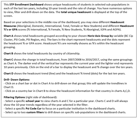
Figure 3: Definitions
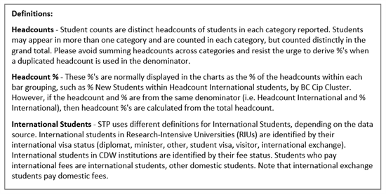
Figure 4: Options for Horiz-Axis Group by Custom Filter #1 and Custom Filter #2

Figure 5: Custom Filter Example
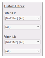
Figure 6: Pop-up Window with Information about Active Dashboard Filters (hover over unique headcount number).
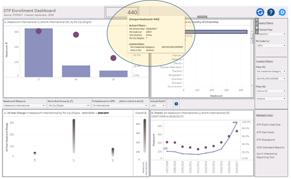
In this example, the pop-up window shows that 440 students were selected in this dashboard of international students (headcount measure) from China (drill-down country selected from Chart B) at UBC Vancouver in 2016/2017 (primary filters) in Bachelor’s Degree (Science) programs (Filter #1 and #2), grouped by 2-digit CIP (horizontal axis group). An asterisk (*) in the filtering pop-up-window indicates multiple or all groups were selected for that variable. In this example, multiple 2-digit CIPs are reported (27, 40 and 26), but if the user clicked on the bar for CIP 27, for example, then the filter would be adjusted to include CIP 27 only.
Figure 7: Drill-down example.
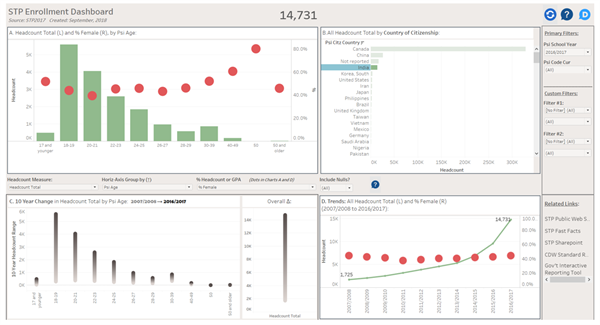
In this example, the dashboard shows the age distribution for students with citizenship = ‘India’ registered in all 25 B.C. public post-secondary institutions in academic year 2016/2017. The red dots in charts A and D indicate the percentage of female students, by reading the % values from the right-axis.
