Student Outcomes: Kicking it up a Notch with Tableau
In preparation for reaccreditation, Dartmouth’s Office of Institutional Research decided to transform student outcomes data from multiple sources and formats into compelling visualizations. The publicly-available visualization can be found here.
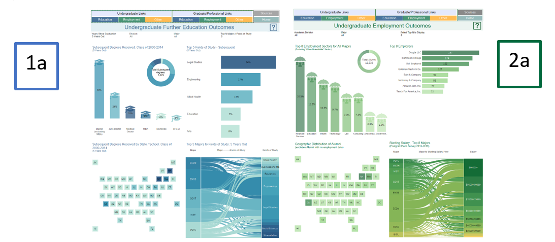
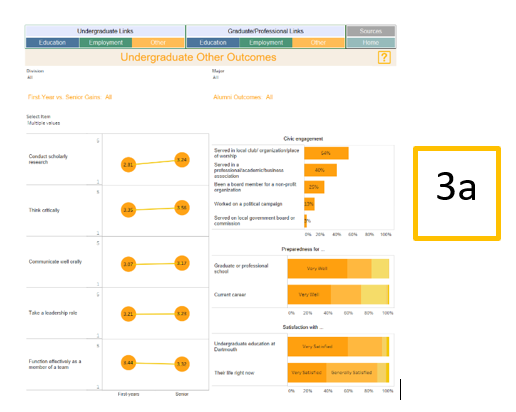
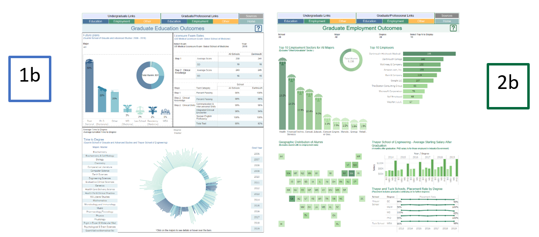
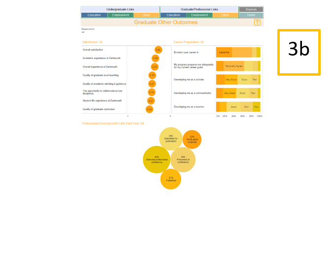
In 2015, the office transitioned to interactive dashboards using Tableau, and decided to expand our current capabilities by melding an infographic approach with dashboards using actions. In the end, a 7-dashboard series operates as one.
First, the user is taken to an infographic-type landing page dashboard, where outcomes are divided into three color-coded categories—Education, Employment, and Other Outcomes—across various student levels (Undergraduate and Graduate/Professional). This landing page provides institution-level KPI’s by level/category.
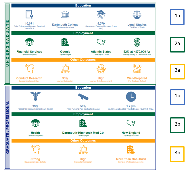
Once you click on a landing page KPI, you are taken to the level/category detail dashboard. At the top of each dashboard is a fixed navigation bar. The use of identical bars for all dashboards provides the appearance of being on one page as you navigate through the levels and categories.

As previously noted, there are three categories of outcome data across student levels:

