Effective Data Visualization Strategies at Small Schools

The Data Visualization Challenge at Small Institutions
Higher education institutions are seeing the value more and more in their data assets. Small universities need to make data informed decisions but face the challenge of very limited financial resources for Institutional Research (IR). Making timely and data-informed decisions requires a well-developed Business Intelligence (BI) system that can pull data from several areas of the business from admissions to finance. Usually, the architecture that supports a data warehouse is a costly investment. The purpose of this article is to show creative ways institutional researchers with limited resources are creating data visualizations to help answer some of the biggest questions around enrollment. We highlight two strategies that have been effective at small institutions.
Strategies
1. Leverage Existing Software and Platforms for Pre-Census Data Tracking
In many cases, high quality and compelling visualizations for reports can be created using software that already exists at the institution. For example, Microsoft Excel® and Power BI® are available on most college campuses and are quite versatile in their graphing capabilities. Many commonly used student information systems (e.g., Banner, Blackbaud) and customer relationship management systems (e.g., AMP, Embark, Slate) contain their own visualization capabilities. IR professionals may need to work with their IT colleagues to get access and training to use those modules but it can be worth the time and effort.
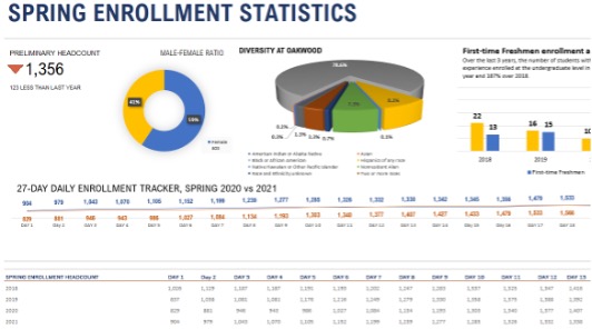
Oakwood University is a private, historically black, non-profit University located in Huntsville, Alabama, with a total enrollment of 1,356. Since COVID-19 has negatively affected enrollment for many institutions, data visualizations can add tremendous value to decision making during the census period. While it is a standard practice that IR professionals collect and maintain a robust, official census data set for institutional reporting and analysis purposes, senior leadership may find the pre-census data valuable to inform recruitment, marketing, strategic planning, and budgeting activities. This elevates the IR role from reporting just the final numbers to providing disaggregated results and analysis. To do this, a dashboard in Microsoft Excel® was created to track and compare the enrollment disaggregated by different subgroups daily.

Figure 1: A part of the comprehensive daily enrollment statistics dashboard designed in Excel. The dashboard covers comparative analysis of Spring enrollment statistics on several variables including a 5-year total enrollment comparison broken down by different demographics.
Microsoft Excel® is a data analysis tool that is widely used by Institutional Researchers. Most often, the datasets that are extracted from an ERP and SIS are captured as Excel files and then may be used in other software that is preferred by the analyst for data analysis. Microsoft has added several features in Excel in recent years, one of which allows users to use beautiful, dynamic templates with dashboards. The dashboard in Figure 1 is one of several Excel templates that is available, free of charge, and used in IR at Oakwood. The templates have dynamic codes that allow the user to enter information on worksheets that populate the main dashboard. This dashboard is an extended version of one of the templates that include other variables that are of interest to Oakwood such as status, state, and race/ethnicity. The codes require some familiarity with Excel functions, but once understood, they are easy to manipulate. Although decision-makers are mostly interested in the final numbers, this type of data analysis adds value to decision-making. Furthermore, IR professionals can make a tremendous impact during the census period using low-cost data visualizations.
The dashboard has enabled management at Oakwood to adequately allocate and reallocate resources in financial aid and registration offices to increase the number of students financially cleared before the census date, and this has improved the institutional profile. It has informed how we allocate aid and how we have increased student diversity and inclusion. Also, it has enabled the development and refinement of enrollment forecast models early.
2. COVID-19 Tracking Dashboard – A Collaborative Approach
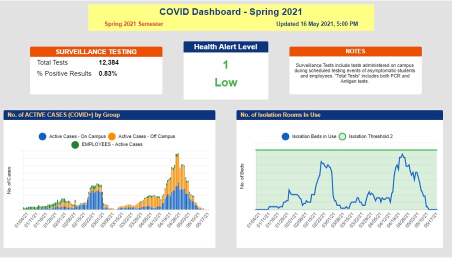
Mount St. Mary’s University is a private, residential Catholic University in central Maryland with just under 2,000 traditional undergraduates. During the 2020-21 academic year, tracking COVID-19 cases among students and employees was a critical component of our emergency action plan. This required integrating data collected by several different offices and from different software platforms. An integrating technology platform that sits on top of our major business platforms was not available on our campus. Our challenge was to integrate data from numerous offices and platforms into one cohesive, real-time dashboard.

Figure 2. A portion of the COVID-19 dashboard at the end of the spring term from Mount St. Mary’s University. The number of active cases each day is depicted in the lower left panel and the number of isolation beds in use by day is in the lower right. The vertical axis values have been omitted for data confidentiality.
The strategy we employed was to funnel all of the data into one centralized database as it was collected rather than allow each office to enter data into their own preferred system and try to extract and integrate the data later. Data were collected from a number of offices including student life, residence life, public safety, physical plant, Provost, our healthcare partner, and a team of 17 volunteer contact tracers. We developed data collection procedures and online forms followed by training sessions for the 24 employees involved in the process.
We chose SmartsheetTM as our data collection and reporting platform because it is cloud-based which facilitated collaborative use of worksheets. It incorporates hierarchical levels of security for users based on roles. In addition, data from multiple spreadsheets can be rolled up into a single real-time dashboard. We had been using Smartsheet for managing several projects on campus so many people were already familiar with it, which helped reduce the amount of training needed. As in any interdepartmental initiative, gaining buy-in from individuals across campus is usually a thorny challenge. In this case, the “all hands on deck” environment that was created by the COVID-19 pandemic softened interdepartmental barriers and fostered a collaborative spirit. In summary, by requiring data collectors to use a single platform for data collection, the summarization of data was much more streamlined.
 Tanisha C.S. Lewis serves as statistician and institutional researcher for Oakwood University. She is a key member of the institutional data governance, and reaffirmation steering committee. (tlewis@oakwood.edu)
 Dr. Jeffrey A. Simmons is responsible for coordinating university-wide assessment, compliance reporting, data analytics, and tracking implementation of the strategic plan. He also serves as co-chair of the reaccreditation self-study steering committee. (simmons@msmary.edu)
