Data Visualization: Quick Tips
 In this article we will be discussing the key aspects of creating effective dashboards that convey useful information and visualizing survey results.
Communicating quantitative and qualitative data in an easily digestible format can be quite complex. There is no one-size-fits-all approach when creating visualization, as every institution’s data maturity, need, and story is different. But creating an effective dashboard starts with identifying the story that we want to convey while finding ways to effortlessly answer related questions. Regardless of the format we choose to display and communicate our data, the audience should not feel overwhelmed.
Institutional researchers are instrumental, as they know the institution’s data well and can use this advantage to create visually attractive data displays and coherent content to engage audience.
Main steps to consider when creating effective dashboards:
- No matter who the audience is, consider creating a visual display that is simple yet useful for as many people as possible.
- Make sure your data display is not too crowded while including enough information and useful comparisons. One-page dashboards are recommended for providing a compelling story.
- Is your data story emphasized? If not, focus on how to bring the story to the front line for your audience.
- Educate your audience, either with an opening page, definitions page, or captions. If the dashboard is intended for an institutional audience, consider setting up short training/feedback sessions with different departments.
- Use different colors to identify positive or negative trends that are standard across different pages.
Check with the institutional ADA department before the dashboard is published, as the background and content colors, font, and font sizes are very important for accessibility. The ADA department at your institution can provide you with some useful guidelines. The data visualization tool you choose might have some ADA content or tips about accessibility on their website as well.
There are several areas of IR work that require different considerations to effectively convey the information through visualizations; a main area is survey research. Survey results can be some of the most difficult data to visualize because of the breadth of content and variety of response options. Using the National Survey of Student Engagement (NSSE) survey as an example, which includes Likert scales, many universities visualize the results through bar charts or heat maps. (Figure 1).

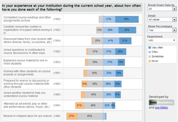
When visualizing Likert scale data, there are many things to consider. First, the traffic light (red/yellow/green) color palette is not color-blind friendly, so consider using something like a blue/orange palette instead. Also, it’s important for users to be able to compare responses across questions, and making it very long (like the top left corner example in Figure 1) or stacked bars (like the bottom example in Figure 1) is not conducive to such comparisons. Steve Wexler, Tableau Hall of Fame Zen Master and founder of Data Revelations, encourages visualizing survey data by using a diverging bar chart. He re-did the NSSE survey in this fashion (Figure 2).

Figure 2. Makeover of NSSE result data to better allow readers to compare responses and see the distribution of behaviors/responses done by Data Revelations founder Steve Wexler. Source: https://www.datarevelations.com/resources/mostly-monthly-makeover-utah-state-university-survey-of-student-engagement/
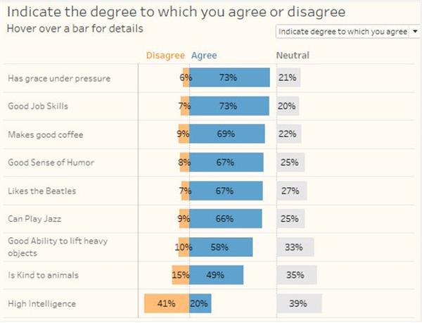
This allows the reader to quickly identify which activities students do often or very often across all questions in the category. It was determined that the “Very Often/Often” and “Never” responses were the more important results to focus on, not the “Sometimes” responses. So, we colored the “Sometimes” gray so that they do not standout as much. Depending on the survey, another way to handle neutral values is to put them off to the side, as shown in Figure 3, so that the “Agree” and “Disagree” options truly stand out.

Figure 3: Putting the neutral responses to the side helps show not only the growth of neutral responses but also highlights the differences in agree and disagree responses.
Useful Sources:
- https://www.datarevelations.com/visualizing-survey-data/
- https://docs.microsoft.com/en-us/power-bi/create-reports/desktop-accessibility-overview
- https://powerbi.microsoft.com/en-us/blog/the-art-and-science-of-effective-dashboard-design/
- https://help.tableau.com/current/pro/desktop/en-us/accessibility_best_practice.htm
- https://www.tableau.com/about/blog/2017/10/7-tips-and-tricks-dashboard-experts-76821
