Seeing Is Believing: Using Power BI to Visualize Alumni Earnings
As higher education institutions continue to recover from challenges presented by the pandemic, they are forced to grapple with persistent nationwide enrollment declines as well as student perceptions regarding the value of a college education. A May 2021 survey by Third Way and New America found that 65% of current college students agree that “higher education is not worth the cost to students anymore.”
The U.S. Census Bureau, University of Texas System, Penn State, and others have made efforts to shed light on the value of a college education by publishing publicly accessible and transparent outcomes data. This Tech Tip explores some of the behind-the-scenes techniques used in Microsoft’s Power BI to create interactive dashboards containing alumni employment and earnings information.
Show or Hide a Visual Based on a Selection
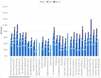
The default option for displaying data in Power BI is to show all data before any selection or filter is made. This can quickly overwhelm a user and turn them off to using your dashboards. Keep it simple. We’ll show you how to do that in three easy steps.
Transform this:
Into this:
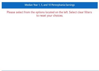
Start by creating a DAX measure for your message to display when nothing is selected. This should inform the user of the steps they need to take to display data. In our example, we use the following DAX measure:
Message_Majors =
IF(
ISFILTERED(Earnings[Major]),
"",
“Please select from the options located on the left. Select clear filters to reset your choices."
 )
This formula essentially says: If a major is selected, do not show any text, otherwise, display the message in quotes.
Next, create another DAX measure—a filter measure to check if a slicer selection has been made on your report.
Check Filtered =
IF(
ISFILTERED(Earnings[Major]),
1,
0
)
Add this measure as a filter on your visual by placing the measure on the filters pane and setting it to show when the value is 1.
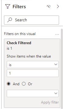
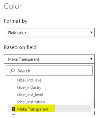
Next, create a third measure to make the visual toggle between showing and not showing. Tip: Use the hexadecimal code #FFFFFF00 for transparent.
Make Transparent =
IF(
ISFILTERED(Earnings[Major]),
"#FFFFFF00",
"White" )
Now with all your measures created, it’s time to put them into action. First, create a card that will sit where you want your message to show and put the first DAX measure you created into the fields box.
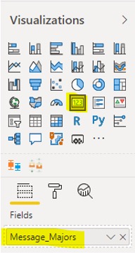
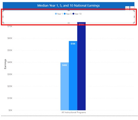
Finally, implement the transparency by clicking the Format button and turning on the background on the card. Click on fx and change the option to format based on field value.
Assigning a Dynamic Link to a Program
Linkages between CIP listed outcomes and programs help users find more information and connect them with related resources. Power BI allows you to assign a Web URL category to a column.

Once you have your links in your dataset, simply create a table in Power BI and add your columns to it.
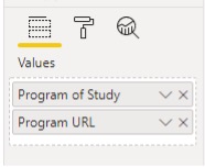
If the data are categorized as Web URLs, Power BI will automatically generate them as hyperlinks in your table.
This process of displaying these data builds off the same fundamentals we previously discussed. Because Power BI will display all data until a selection is made, a filter check measure needs to be added to prevent overwhelming a user. Fortunately, if it’s the same data as being displayed elsewhere, you can re-use the filter check measure.
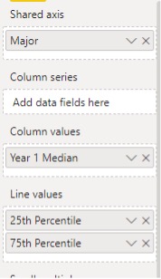
Visualizing Percentiles
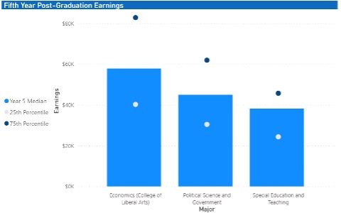
Visualizing percentiles is important for understanding the range of earnings related to a college degree. For example, alumni can leverage the percentile information to understand what constitutes a competitive salary offer or to assist in negotiating for a higher salary.
Providing Downloadable Data
There are a few limitations when publishing public reports using Power BI. One of these limitations is the inability for users to export data from visualizations to conduct their own analysis external to the report. One work-around we have developed has been to build a .csv file with the data and add it as a link that users can click on to download all the data from the dashboard.
One of the fastest ways to do this is to build in Power BI a table of the data you want users to be able to download. This will allow you to aggregate the data and confirm that the data you are providing will match what is being used in the dashboards.

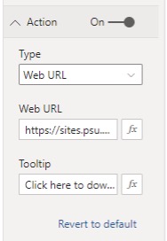
Clicking the ellipsis on the top right corner will allow you to download a .csv version of the data table. Next, find a place to host the data on the internet—for example, SharePoint or your office’s public website. Then add a button to your report that links to this .csv file. Make sure to turn on the Action and set it to Web URL.
You could also consider adding a clip art Excel logo so users know is the downloadable file is compatible with Excel. Be sure to add the same action to the icon so that regardless which button the user clicks on, it will download the data.

 Shannon Lee, Ph.D. is a research associate in the Office of Planning, Assessment, and Institutional Research at the Pennsylvania State University. At Penn State, Shannon has pioneered a wage-matching program that tracks employment and earnings outcomes of Penn State alumni in the state of Pennsylvania. To learn more, visit the We Earn website at https://weearn.psu.edu/. Shannon earned her Ph.D. in Workforce Education and Development from the Pennsylvania State University and her Master’s degree in Public Administration from the University of Baltimore.
 Karen S. Vance, Ph.D., is the associate vice provost for institutional research in the Office of Planning, Assessment, and Institutional Research at Penn State. She has been engaged in educational research, analytics, assessment, and planning for more than 20 years with experience across the P-20 spectrum. Her teaching experience includes various psychology courses, including statistics for psychology majors. She holds a Ph.D. in Experimental Psychology from Texas Christian University with an emphasis in social cognition and stereotypes.
