A Three-part Series on the Application and Production of Shiny Applications for IR: Part 2
This is the Part 2 (see Part 1 and Part 3) of a three-part tutorial on why and how to adopt Shiny applications for IR offices. In this section, we will introduce the main components of a Shiny app and provide some examples to illustrate how to build an app. You do not necessarily need to have R or RStudio installed on your machine to gain knowledge from this part of the tutorial. However, if you want to follow along with the examples in a hands-on manner, it would be ideal to have R and RStudio installed and launched on your computer. Instructions for installing R and RStudio are available in the introductory chapter of Mastering Shiny (Wickham, Hadley).
The Main Components of a Shiny Application
Now that we know what Shiny is and its potential benefits in IR, let us start by outlining the technical fundamentals of a Shiny application. There are three main components that form the structure of any Shiny application:
- User Interface (UI): This is the front-end portion of the application, which forms the appearance and layout of the application as well as accepts certain user input values.
- Server Function: This is the back-end portion of the application, which takes and processes the user input values from the user interface to produce output results that are later rendered back into the UI for users.
- Call to the Shiny App function: This fuses the UI and server components to create the application/web page.
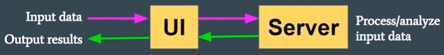
Figure 1 displayed below is a graphic created by Dr. Chanin Nantasenamat, who is a professor and creator of data science educational content and instructional videos. It provides a good visual representation of how these components work together in a Shiny application (R Shiny for Data Science Tutorial – Build Interactive Data-Driven Web Apps, YouTube). Starting from the top left of the visual, we see input data flowing into the UI, where users choose certain inputs to select how they want to interact with the data. The user input selections are fed to the server, which processes the information to produce output. Finally, the output from the server is returned and displayed in the UI. The arrows, or communication channels between the UI and server, are created through calling the shinyApp function.
Figure 1: Visual representation of Shiny application components (from Nantasenamat 2023)
Toy Example: Selecting and Displaying the name of a Big 10 Institution
To further illustrate how these components work together to form a Shiny application, let us consider a toy example. This example allows a user to select and print an institution name from a list of institutions in the Big 10 Academic Alliance as of September 2023. Figures 2 and 3 display the annotated R code and the resulting Shiny application created from the R code, respectively.
Figure 2: Example R code that produces a web application for selecting and displaying the name of a Big 10 institution
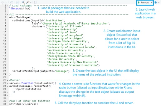
Figure 3: Web application for selecting and displaying the name of a Big 10 institution
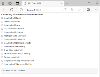
Go to Figure 3 Example: https://connect.posit.iu.edu/content/a98c37bc-50f9-4f21-bf47-dc6d829167d0
The first step when building a web application is to install and load any relevant R packages. In this case, we only load the extension package by calling it inside the library function. If this is your first introduction to R and you do not know how to install R packages or you are unsure of how to create a blank R script in RStudio, there are some helpful shortcuts and tips available for review in Chapter 1 of Mastering Shiny (Wickham, Hadley). Aside from the section of code that loads the necessary R packages, you will notice that remaining sections of code represent the three components that were mentioned previously: UI, server, and the call to the shinyApp function. At this point, do not worry too much about the details of the code and functions called within the UI and the server (radiobuttons, renderText, etc.). We will touch on these objects/functions in more detail in a future installment.
Recall that the UI portion of the code collects user inputs and displays any resulting output back in the web browser. In this case, we can see that the R code for the UI contains two blocks of code: 1) the first creates HTML that will render a radio button with a list of Big 10 institutions, and 2) the second creates HTML that will display the selected institution to the user. The server portion of the code serves the purpose of recording and processing any user inputs from the UI and making on-the-fly updates to the HTML created in the UI to display the appropriate output. Thus, this example shows one object included in the R code for the server that stores the selected institution as text to be returned for display in the UI. The call of the shinyApp function is simply one line of code that combines the UI and server components.
After you write the R code, you can launch the resulting web application by clicking on the green arrow for “Run App” in the RStudio tool bar. If there are no errors in the R code, this will launch the web application in a local web browser. For demonstration purposes, this example application has been published to Posit Connect, a web server for hosting Shiny apps. You can view and interact with this application by clicking on the link below Figure 3. Selecting an institution updates the input$institution variable. That change is caught by the server and triggers the server-side function, which updates the output$message variable (step 4 in Figure 2) and ultimately the text object on the webpage containing the selected institution.
Another Example: Equity and Inclusion in Science Courses
Let us walk through the final example. This web application, highlighted in Figure 4, uses a synthetic data set (i.e. fictional dataset built based on distributions from actual data) to investigate the extent to which grade distribution gaps exist in science courses at a fictional campus. Like the previous example, this application has been published to the Posit Connect server for demonstration purposes. You can view and interact with this application by clicking on the link below Figure 4. The R code and synthetic dataset used to create this application is available for download via a Github repository if you are interested in downloading the resources and following along.
The application allows a user to choose which science courses they want to include in the display, the granularity of the grade distribution detail, and which variable they want to use to define the equity population (low income, first generation, etc.). In the R code, these user inputs are collected through three Shiny user control functions—checkboxGroupInput, radioButtons, selectInput—for checkboxes, radio buttons, and select dropdowns, respectively. We touch on user control functions in more detail in the third installment of this series. These user selections are then fed to the server to update a data set based on the user’s selections in the UI (filters are applied for certain courses and variable swap calculations are performed to select the specific target population/grade distribution variables). This data set is “reactive” in the sense that any changes to it will trigger downstream events. In this case, the triggered events are updates to the three outputs that will be displayed in the UI: 1) a table of grade distribution frequencies/percentages, 2) a mosaic plot that displays which cells in the grade distribution are higher or lower than expected, and 3) the results of a chi-squared test that tests for independence of the grade distribution and the selected equity population group. The DT and graphics packages provide the functions to produce the frequency tables and mosaic plots within the server. The pairs of functions used in the UI and server code that create and update each of these outputs are: 1) dataTableOutput/renderDataTable, 2) plotOutput/renderPlot, and 3) verbatimTextOutput/renderPrint. More information on render and output functions is provided in the Part 3 of the series.
Through this application, the user is not only able to see the raw grade distribution differences, but also assess these grade distribution differences in the context of statistical significance to make more meaningful inferences. For example, the outputs displayed in Figure 4 indicate that there is sufficient evidence to suggest that there is a relationship between the grade distribution in these science courses and a student’s low-income status (p-value for chi-squared test = 2.18 x 10⁻⁷ < 0.05); the residual/mosaic plot suggests that low-income students had a higher-than-expected frequency of Fs and a lower-than-expected frequency of Bs. Whenever the user selects different inputs, the frequency summaries, plots, and tests update automatically providing real-time analytics for campus decision-making.
Figure 4: Web application for investigating the extent to which equity gaps exist in science courses
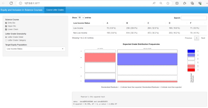
Go to Figure 4 Example: https://connect.posit.iu.edu/eAIR_TechTips_Demo/
Stay Tuned for Part Three
If you have followed the examples in this installment, congratulations!! You have knowledge that can be used to develop your first Shiny app. This also concludes the second part of our three-part tech tips tutorial on Shiny applications in R. In Part 3, we 1) cover concepts for more complex Shiny app development to help you unleash the full potential of this tool and 2) highlight a known challenge for Shiny adoption at higher education institutions.
 Gina Deom has nearly 10 years of experience working in higher education data and research. She currently serves as a data scientist with the Research and Analytics team, a subunit within Indiana University’s Institutional Analytics office. Gina has given several presentations at national and international conferences, including the SHEEO Higher Education Policy Conference, the NCES STATS-DC Data Conference, the Learning Analytics and Knowledge (LAK) Conference, and the AIR Forum. Gina has earned a best paper award from INAIR, AIR, and LAK.
 Jesse Talley has over seven years working in higher education data and research, including four years in institutional research and three years in survey research and administration. He currently serves as a data analyst at Indiana University’s
Institutional Analytics office. Jesse has collaborated on previous conference presentations for the AIR, INAIR, the American Association of Public Opinion Research, and the Midwest Association for Public Opinion Research. He also contributed a
methodological report for an NSF project, portions of which were published in a peer-reviewed journal.
Jesse Talley has over seven years working in higher education data and research, including four years in institutional research and three years in survey research and administration. He currently serves as a data analyst at Indiana University’s
Institutional Analytics office. Jesse has collaborated on previous conference presentations for the AIR, INAIR, the American Association of Public Opinion Research, and the Midwest Association for Public Opinion Research. He also contributed a
methodological report for an NSF project, portions of which were published in a peer-reviewed journal.
 Michael Sauer is Lead Information Management Analyst for Research and Analytics at Indiana University. Mike began his career in institutional research at IU in 2002, and currently serves as an Information Analyst on the Research and Analytics team.
Prior to his time in institutional research, he taught Spanish and Portuguese at IU. He holds a Certificate in Underwater Resource Management from IU, is a certified yoga instructor and an Indiana Master Naturalist. He enjoys being with family,
reading, observing nature, watching IU sports and learning languages. Mike holds a Master of Public Affairs in Environmental Policy and Natural Resource Management, a Master’s in Latin American and Caribbean Studies (both from Indiana University),
and a Bachelor’s in History from the College of Wooster.
Michael Sauer is Lead Information Management Analyst for Research and Analytics at Indiana University. Mike began his career in institutional research at IU in 2002, and currently serves as an Information Analyst on the Research and Analytics team.
Prior to his time in institutional research, he taught Spanish and Portuguese at IU. He holds a Certificate in Underwater Resource Management from IU, is a certified yoga instructor and an Indiana Master Naturalist. He enjoys being with family,
reading, observing nature, watching IU sports and learning languages. Mike holds a Master of Public Affairs in Environmental Policy and Natural Resource Management, a Master’s in Latin American and Caribbean Studies (both from Indiana University),
and a Bachelor’s in History from the College of Wooster.
 Stefano Fiorini Ph.D. is a Social and Cultural Anthropologist with the Research and Analytics team, a subunit within Indiana University’s Institutional Analytics office. He has extensive applied research experience in the areas of institutional
research and learning analytics. He has published in peer reviewed journals and conference proceedings and presented at national and international conferences (e.g. AIR Annual Forum, CSRDE, LAK), earning best paper awards from INAIR, AIR and SoLAR.
Stefano Fiorini Ph.D. is a Social and Cultural Anthropologist with the Research and Analytics team, a subunit within Indiana University’s Institutional Analytics office. He has extensive applied research experience in the areas of institutional
research and learning analytics. He has published in peer reviewed journals and conference proceedings and presented at national and international conferences (e.g. AIR Annual Forum, CSRDE, LAK), earning best paper awards from INAIR, AIR and SoLAR.