Combination Charts in Excel Made Easy
Given that a picture is worth 1,000 words, there will be occasions when you want to make your data visualization show more than just a standard chart. Microsoft Excel offers an easy way to address this by producing a combo chart. Sometimes creating a chart in Excel may cause frustrations, however, with some simple planning, you can have a combo chart to tell your story.
Let's imagine that you work in institutional research at Faber College and you have been asked to provide a visualization that represents the percentage of first-time female applicants, admitted, and enrolled against the overall total numbers for each category over the past five years. You begin by ensuring your data is accurate and a true representation of the population. For this example, you will use the following data in the following format:

The next step is to select the data range and click on the “Insert” tab. Then, you will select “Recommended Charts” and the “All Charts” tab. From there, you select “Combo.”
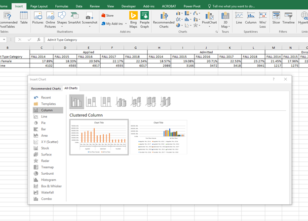
When you select “Combo,” you will be presented with the following:
- Series Name
- Chart Type
- Secondary Axis
For this example, the series names for your data are First-Time Female and All-First Time. You then have the option of selecting the chart type for each data series. You will select a clustered column chart for First-Time Female and a line chart for All-First Time. Last, you will select All-First Time to be the secondary axis. You will notice that Excel provides a preview of the chart.
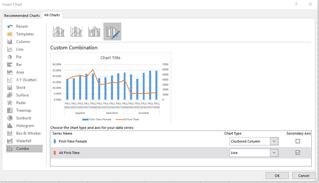
You then click “OK”, add data labels, add axis titles, and a Faber College title using the “Chart Elements” box, and you arrive at the following chart:

You decide that you just do not like the look of this chart. You think it would read better if the line chart was above the bar chart. In addition, you are not too keen on having the “0” on your Y-axis for the counts. So, you decide that you need to do a few more revisions.
In order to raise the line chart, you need to change the bounds on the “Total Number” axis under “Format Axis”. When you double click on the Y-axis associated with “Total Number”, you are able to make those changes. You will change the Minimum to -3000 and the Maximum to 6500 in the Bounds section and under the Units section; you will change Major to 500 and Minor to 100. This step leads to your chart which will look like this:
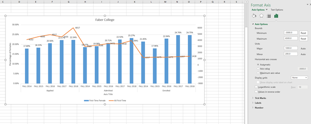
Next, you want to remove the 0 and negative numbers from the axis. You do this by formatting the number in the Number section in the Format Axis section.
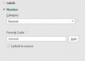
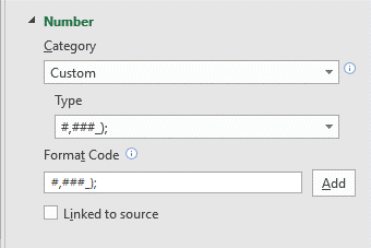
Under Category, you select “Custom,” go to the “Format Code” area and type #,###_); then click “Add”. The result should look like this:
Once this step has been completed, your chart will look like this:
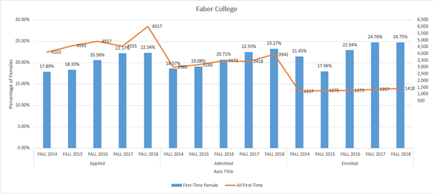
See how the 0 and negative numbers are no longer on the Y-axis. Good work. It is looking better, but you really want the line chart to be totally above the bar chart. You need to adjust the Y-axis associated with the “Percentage of Females.”
You click on the percentages in the Y-axis and notice that the Maximum bound is set to 0.3 (30%). Change the Maximum Bound to 1.0 (100%) and the Major Units and Minor Units to .2, or 20% increments. These revisions produce your desired outcome.
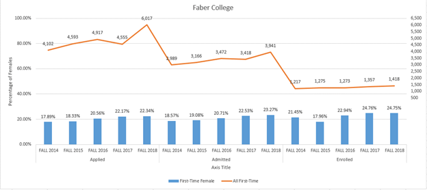
You may now provide your visualization to your colleagues and bask in their wonderment as to how you created such an interesting visual.


