The Story Behind the Stony Brook University COVID-19 Dashboard
In summer 2020, Stony Brook University’s Senior Executive team requested the development and launch of a public-facing dashboard to display information about COVID-19 on the campus. The Office of Institutional Research, Planning & Effectiveness (IRPE) was a lead member of a work group that included Student Health Services, Human Resources, Student Affairs, Campus Residences, and the Office of Emergency Management.
This group identified metrics, data sources, limitations, and data flow. Additionally several existing dashboards were reviewed, including those from the University of Texas at Austin, and the University of North Carolina at Chapel Hill. Conversations with other IR and planning leaders were also helpful—of particular note, Henry Zheng at Ohio State offered insight to issues considered at his institution in developing their metrics for monitoring the campus (their dashboard was still in development as we were building ours).
In developing Stony Brook’s dashboard, we wanted the tool to answer the questions:
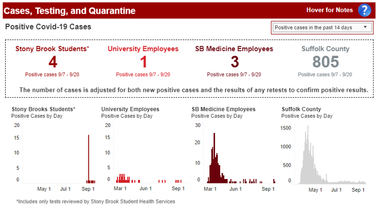
- How many active cases are there among Stony Brook students and employees over time?
- How does that compare to the county?
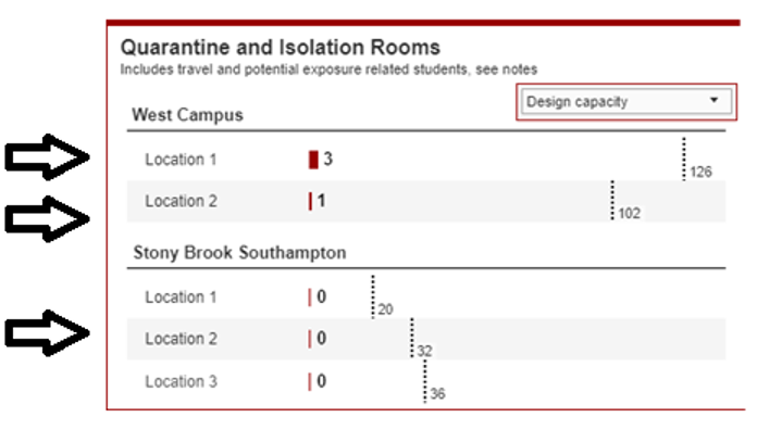
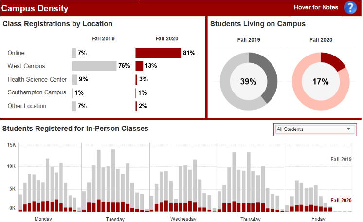
We also wanted to answer questions about how many tests we have conducted, rates for positive tests, and our capacity to isolate students who test positive or quarantine those who may have come in contact with the disease. Finally, we wanted the dashboard to answer questions about how precautions we have taken contribute to safety by showing year-over-year differences in the proportion of students living on campus as well as the profile of in-person classes by day and time vector.
We designed this dashboard to direct the reader from left to right and top to bottom, keeping the most vital information located at the top of the dashboard, and to the left of each section. The large numbers at the top communicate the overarching story of cases immediately, with trend data below them.

Data structures, maintenance, and integration posed considerable challenges in development. This dashboard pulls data from nine separate sources with different data structures and privacy restrictions, including HIPAA and FERPA. In certain cases, like the quarantine and isolation rooms, what looks like a table is three separate visualizations stitched together on the dashboard.

Throughout the dashboard, we tried to limit the use of tables, and to put additional information behind tooltips. This allows the user to quickly understand the current situation but dig further if they wish. By placing things like notes in the hover boxes, we were able to save valuable screen real estate.

Keeping the dashboard live presented some additional challenges. We used a combination of date formulas and server refresh schedules to ensure that the dashboard updates daily, but matches the time frame we are reporting to the state.
We were taken by surprise to learn a website already “grades” institution COVID-19 dashboards: https://www.ratecoviddashboard.com/ratings. It was gratifying to see the thoughtful work of the team reflected in the early grade of an “A” for the dashboard. As of late September, the dashboard had received over 350,000 hits, making it one of the most visited pages on Stony Brook’s website.


