Technical Colleges and Perkins Data
A huge topic for our technical colleges has been the re-authorization of the Perkins law. This law brought substantial changes to procedures for requesting funds. One of the most significant changes was the implementation of public hearings to gather feedback on how funds should be spent.
In conjunction with these changes, it was decided that the entire process should come online. I was charged with developing the website, and the first piece was to develop the feedback page on the data that were presented at the public hearings.
The data to be presented were simple: three spreadsheets containing the information on the new Perkins measures, graduate placement, graduation, and non-traditional. Additionally, there was a single table for the proposed benchmarks.
The platform we are using for the Perkins Web Portal is DNN (DotNetNuke). This is a data driven platform that allows us to gather and analyze data for all things related to Perkins.

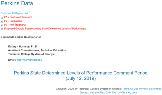
Figure 1 Perkins Data Page
The modular construction of DNN allowed me to make the page expandable. This kept it compact and more readable. Pressing the plus sign opens up the spreadsheet related to that measure.

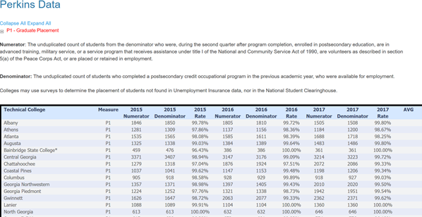
Figure 2 Graduate Placement Spreadsheet
The expanded spreadsheet contains the definition of the measure and then the data itself.
The only other piece of the page was an email link so that the public could send their comments to the assistant commissioner.
