Visualizing Regression Results for Non-Statistics Audiences
The Office of Assessment at the University of North Florida (UNF) uses infographics to succinctly visualize student engagement and success data. We’ve found them to be a useful platform to share focused messages with the university community that are quick and easy to consume. Infographics have been especially useful when we’ve communicated the results of statistical modeling, which can be challenging to digest for faculty and staff members who may not be accustomed to or trained in interpreting traditional statistical tables, graphs, and notations.
View full UNF Osprey Roadmap: GPA - 1st & 3rd years (PDF)

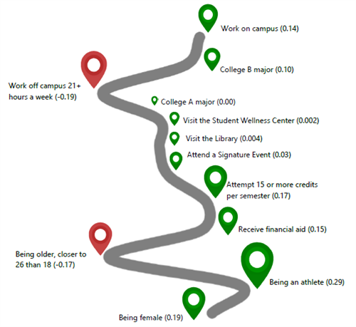
The selected infographics visualize the results of recent linear regression modeling on the various factors that influence undergraduate students’ pathways through the first and third years. All data come from UNF’s student information system, which integrates student self-reported data (e.g., time spent working for pay) and student ID card-slide data (e.g., student visits to campus locations and attendance at events like campus life programming) alongside traditional student data. Based on Astin’s (2012) classic Input-Environment-Outcome framework, the modeling includes factors that represent student background characteristics (“Input”) and student decisions, attitudes, or interactions with the university environment once in college (“Environment”). The “Outcome” for these specific infographics is cumulative GPA at the end of the 2017-18 academic year.
The visualizations carry two messages: 1) various factors influence students’ GPAs, and 2) the influences are different for first-years compared to juniors. Green map markers represent statistically significant coefficients in the regression model that positively influence students’ GPA, and red map markers represent statistically significant negative coefficients. The size of the map marker represents the strength of a given predictor’s association with GPA relative to the overall regression equation. The grey winding “road” is actually a graphical representation of the coefficient values, so the depths of the curves are meaningful in that they represent the weight of each coefficient value on the outcome variable (GPA).
These infographics have helped campus community members assess where their unique services and programming contributions fit within the larger picture of student success given the various input and environment characteristics that influence students’ academic success. They have also generated data-informed discussion about ways to support students’ success, such as increasing opportunities for students to work on campus and encouraging attendance at signature programming events.
Reference:
Astin, A., & Antonio, A. L. (2012). Assessment for excellence: The philosophy and practice of assessment and evaluation in higher education. Lanham, MD: Rowman & Littlefield Publishers.
